HONDA MYGARAGE
Improving a large-scale ownership experience through research and targeted design
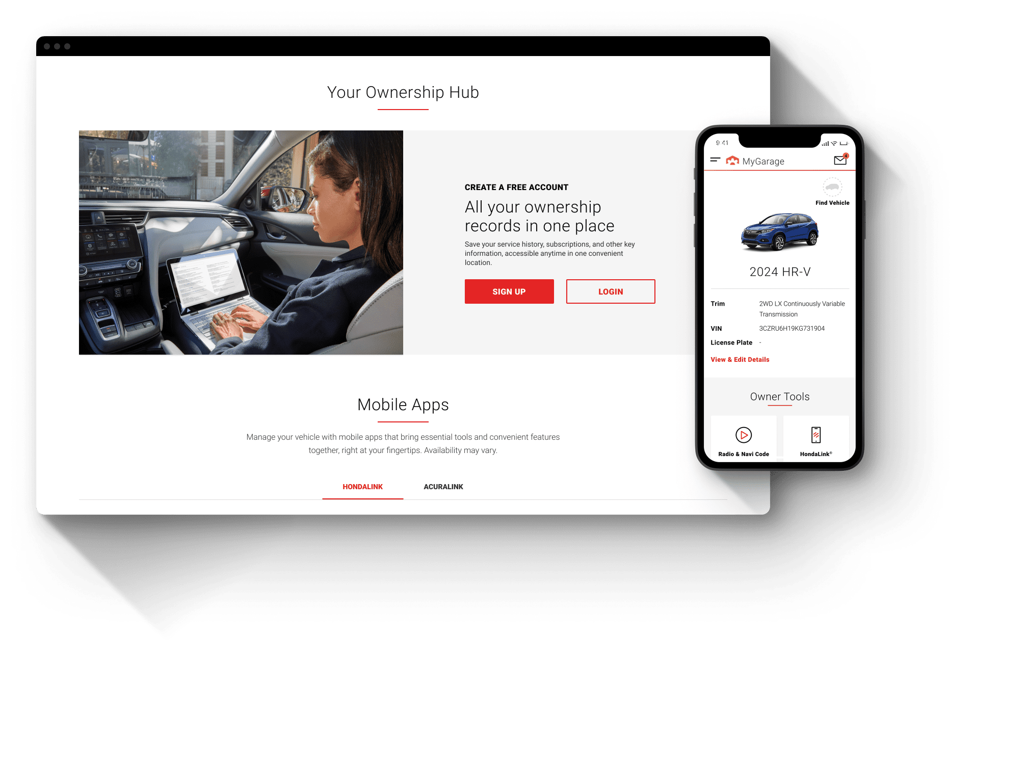
A consumer site redesign that improved navigation, high-value tasks, and brand clarity across a complex five-brand ownership experience.
ROLE: PRODUCT DESIGNER
Product Design · Design Strategy · UX/UI Design · Information Architecture · Interaction Design · Prototyping · Usability Testing · Data-Informed Design
TIMELINE
2023 - 2026
1M+
Visitors per month
5
Brands
3
Years
47 Pt
Improvement in user satisfaction
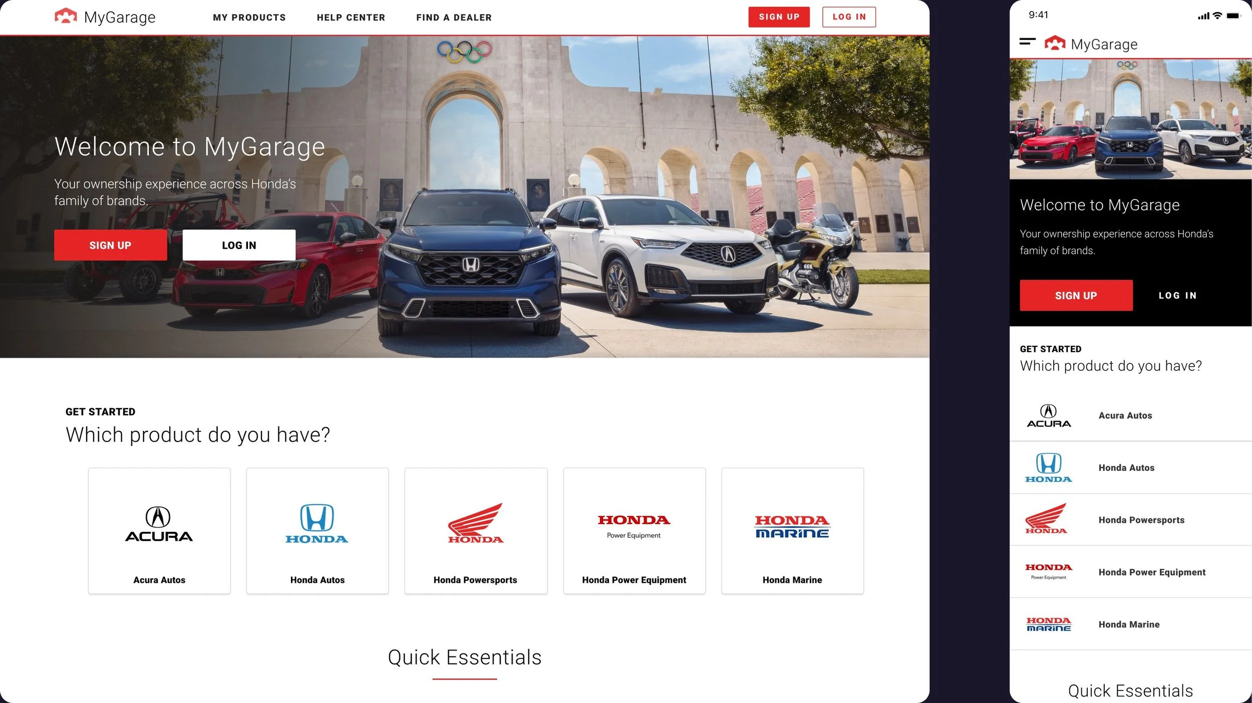
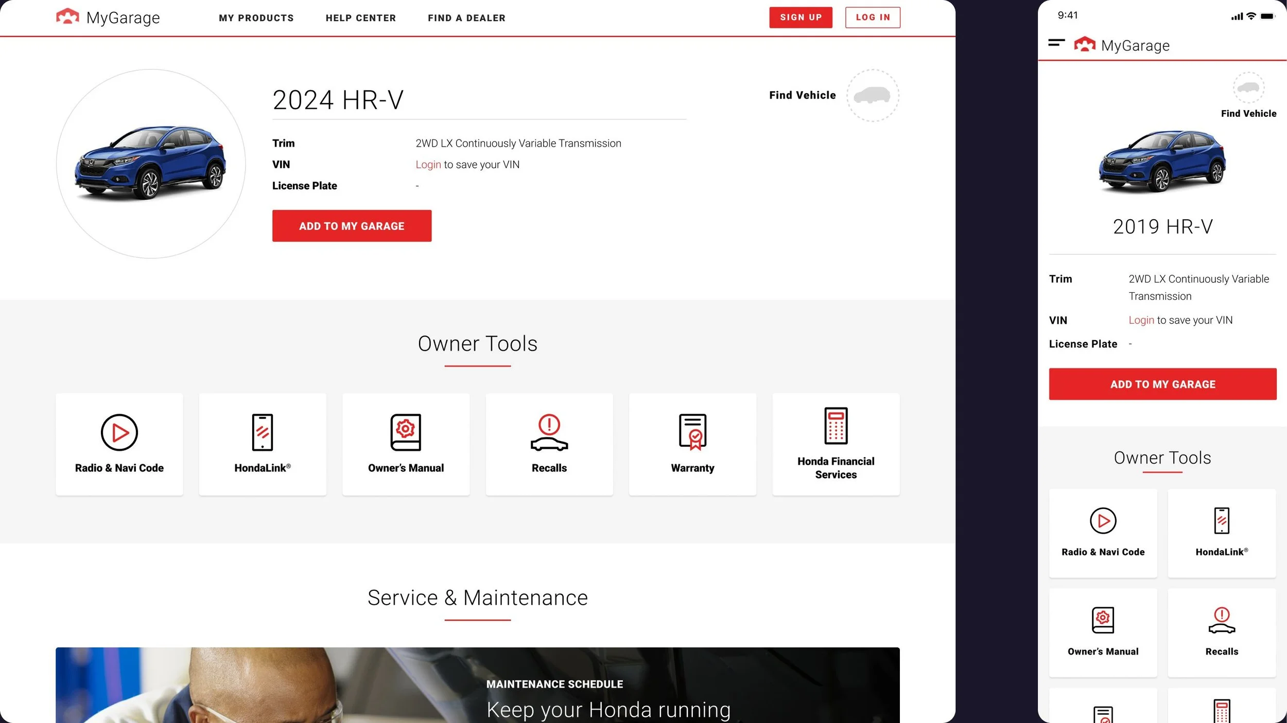
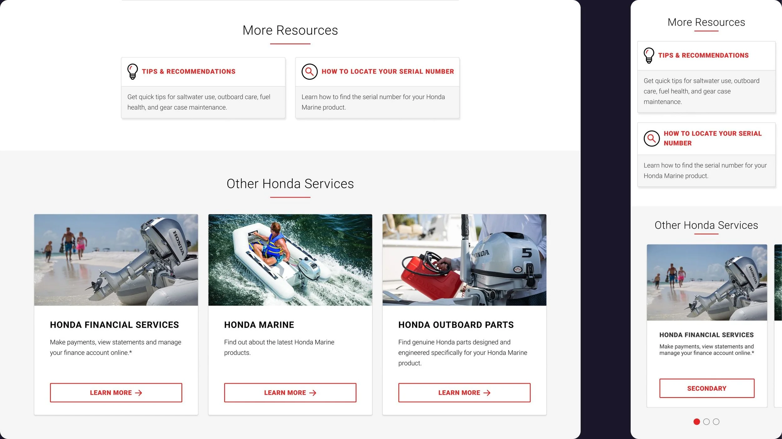
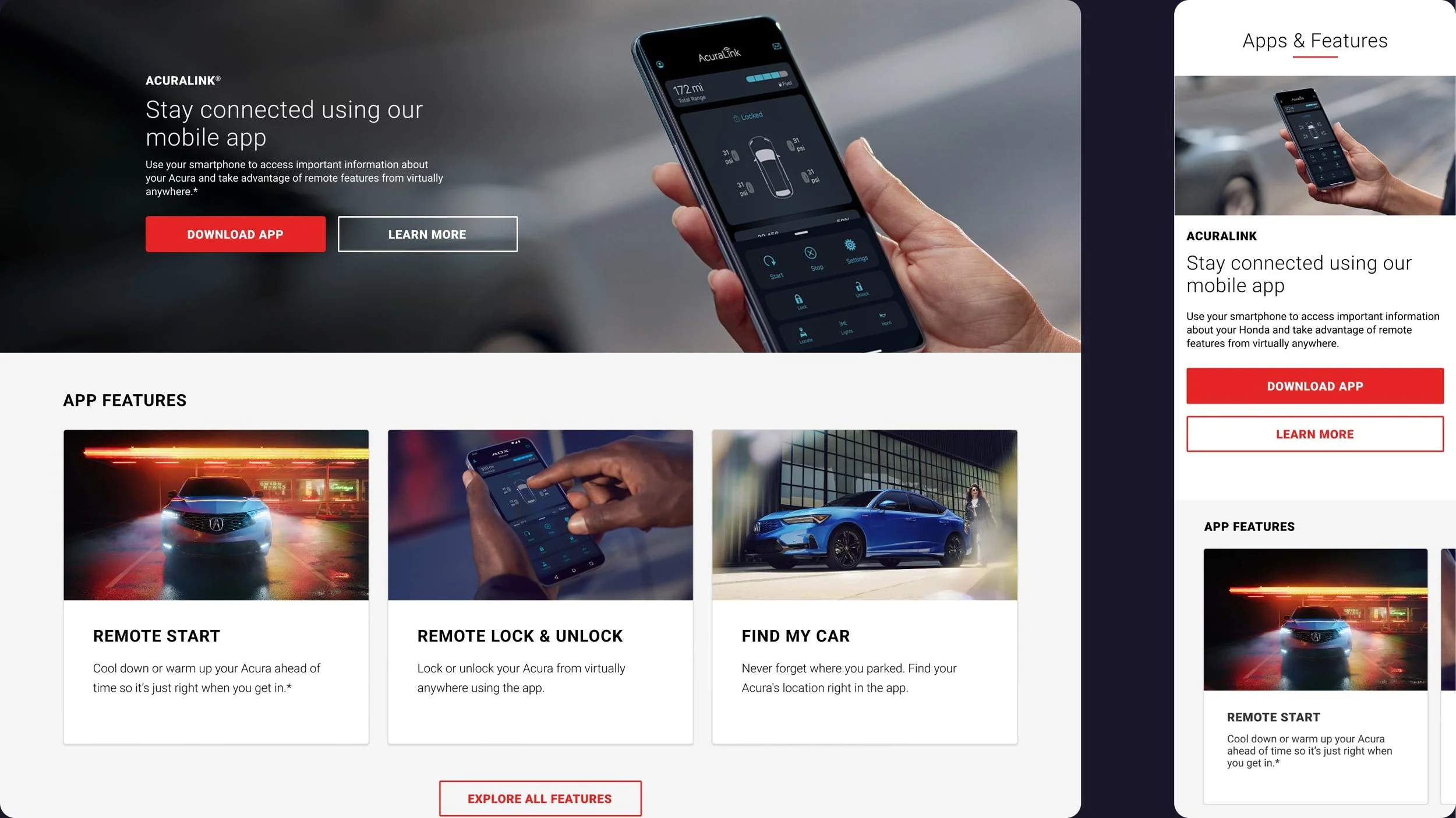
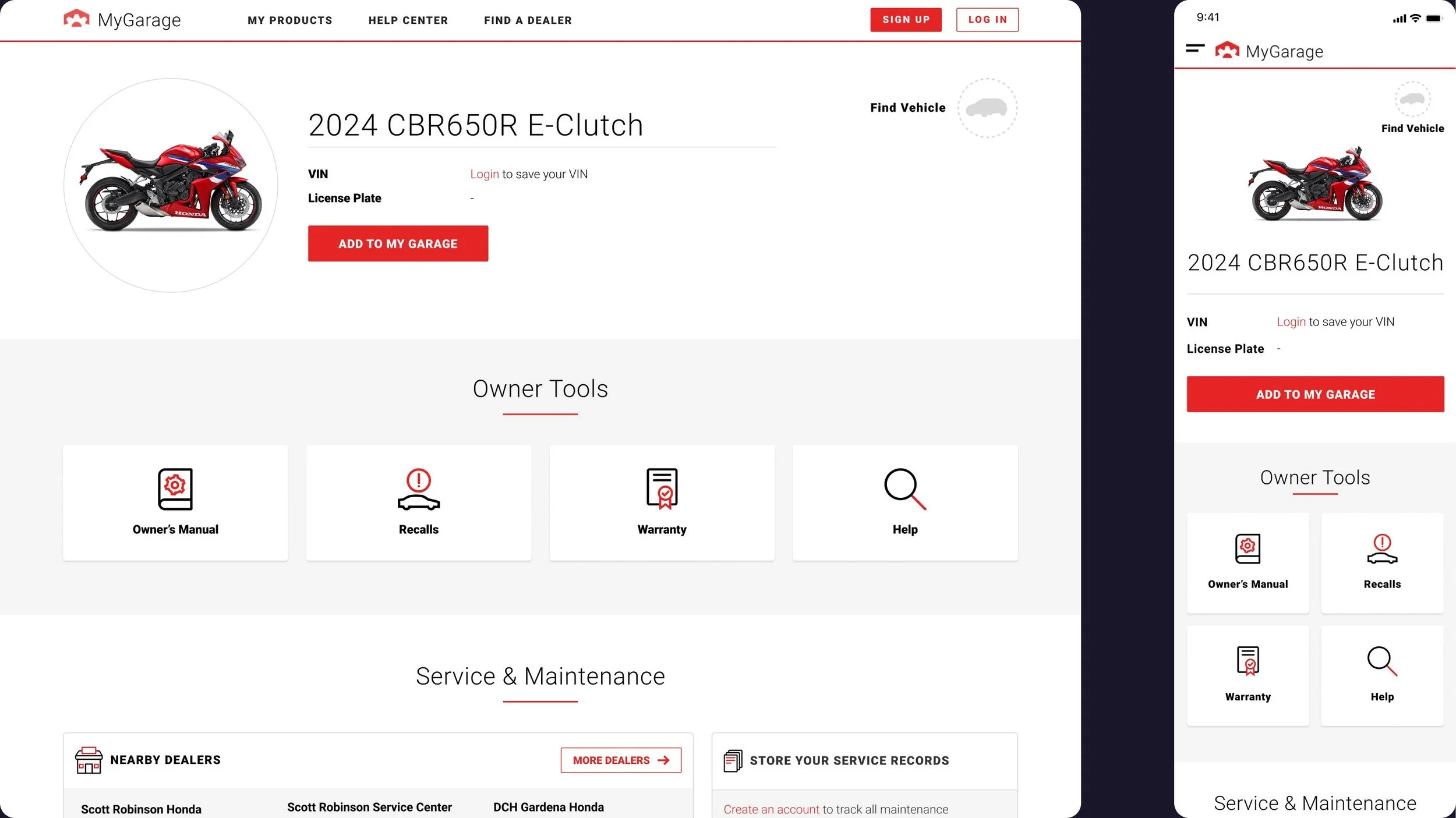
MyGarage supports owners across five brands: Honda, Acura, Powersports, Power Equipment, and Marine.
The site had just launched when I joined the team, but user satisfaction was low. Usability testing and survey data showed that owners were struggling to understand where they were, find what they needed, and complete basic tasks. The generic unbranded visual design even made some users think MyGarage was a third-party site.
A broader redesign would have addressed these issues more fully, but there was little organizational appetite for one. Instead, I focused on targeted IA, UI, and content improvements that could meaningfully improve the experience without rebuilding it:
TRUST → Clarify the ownership experience
NAVIGATION → Make important information easier to find
TASK FRICTION → Reduce friction in high-value tasks
AUTHENTICATION → Make personalized experiences clearer
User Frustration
-
![]()
Trust
“Is this an official Honda site?”
-
![]()
Navigation
“Where do I find what I need?”
-
![]()
Task Completion
“Why is this so difficult?”
-
![]()
Authentication
“Why do I need to log in?”
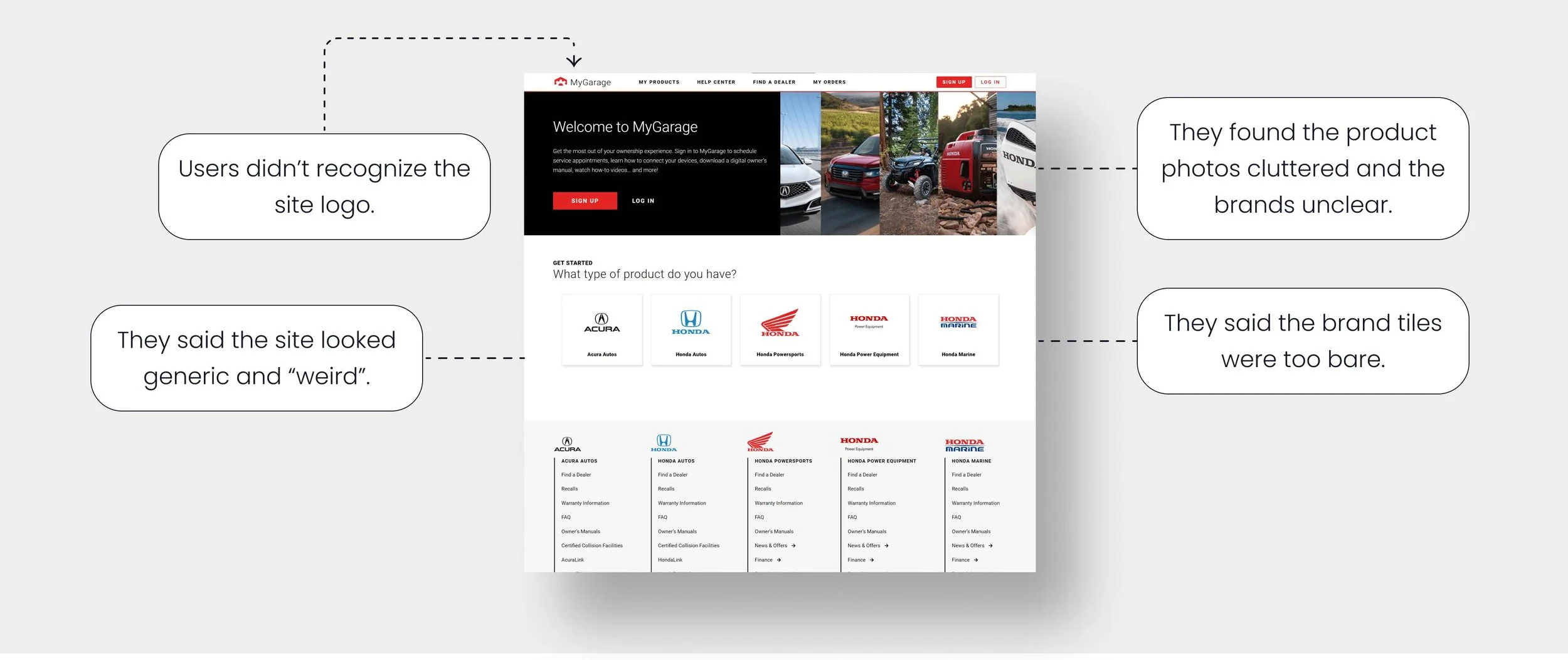
The homepage needed to quickly establish trust and help users find what they were looking for.
The five brands needed to feel clear and credible, and users needed an easy path to the content they came for. Working within a shared Honda design system also meant finding ways to improve brand clarity without making drastic visual changes. I explored two ways to balance those needs within the realities of a five-brand experience: creating five distinct brand experiences and preserving a unified homepage.
Homepage Options
1: Re-architect the brand experience to create five distinct experiences.
-
Gives each of the 5 brands its own branded homepage with high-res imagery. Replaces the generic brand chooser tiles with a branded top navigation and the MyGarage logo with each brand’s logo.
-
Provides a vehicle chooser within each branded homepage to lead users to the content-dense vehicle page. In addition, adds direct links to the site’s most-used features. View user flow diagram.
-
More comprehensive UX solution for brand clarity and cross-brand navigation.
Builds on the existing five-brand information architecture by adding only a parent navigation layer.
-
Printed materials, such as owner’s manuals, could not be updated, so a version of the non-branded homepage would still need to remain.
Would require digital properties across the enterprise to update links currently pointing to the main MyGarage homepage.
2: Preserve the unified entry point, but make the most-used tasks easier to find.
-
Keeps one homepage for all five brands, but uses a unified hero image and copy that clearly identifies the official Honda ownership experience.
-
Adds direct links to the site’s most-used features. Uses a brand chooser modal to route users to the right product page lookup. View user flow diagram.
-
Digital and print properties could continue linking to the existing homepage.
Lighter development lift, leaving capacity for other improvements.
Improves access to multiple high-use features while maintaining the existing path to the product page.
-
Less differentiation between brands.
Option 2 offered the stronger balance of customer impact and feasibility.
Option 2 was the winner:
It avoided the organizational cost of repointing multiple digital and print properties to separate branded homepages.
It created a strong improvement in task discoverability by providing direct access to more of the site’s most-used features.
It strengthened brand clarity enough to increase trust in the site.
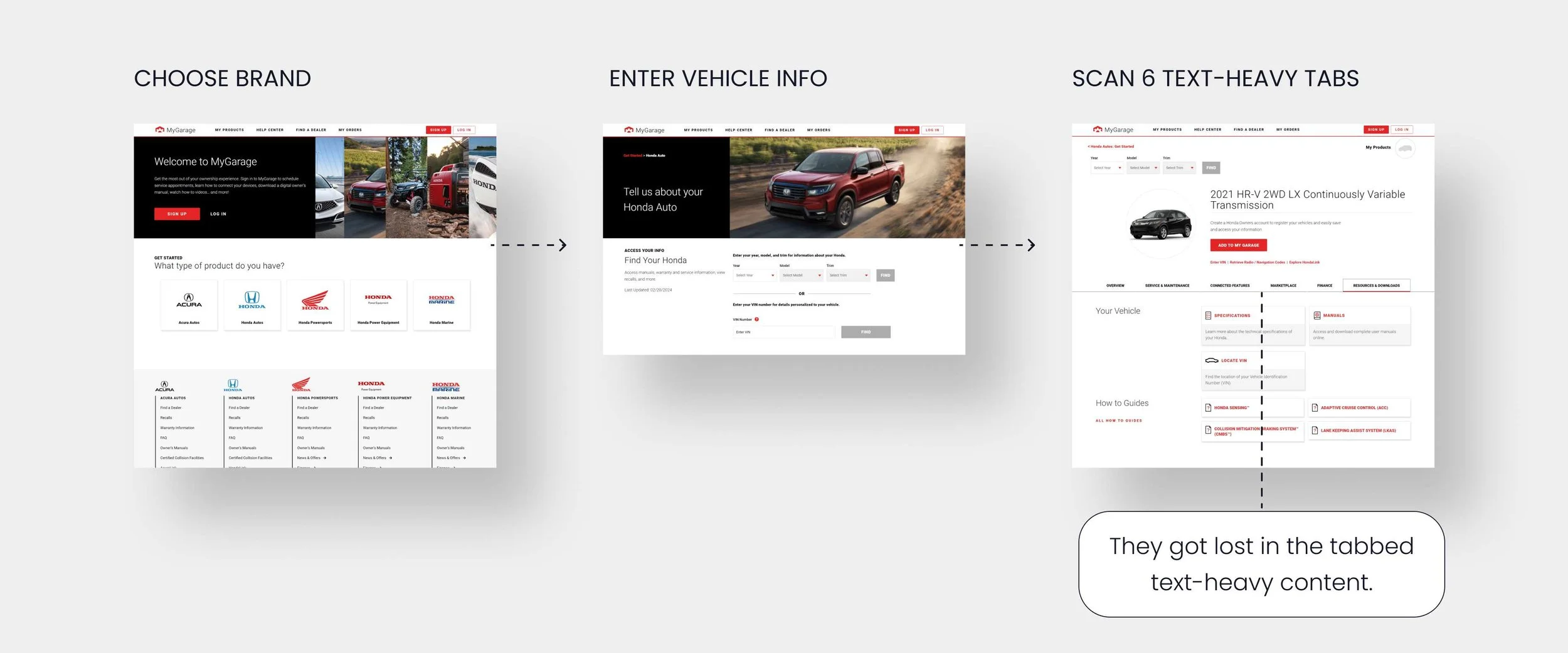
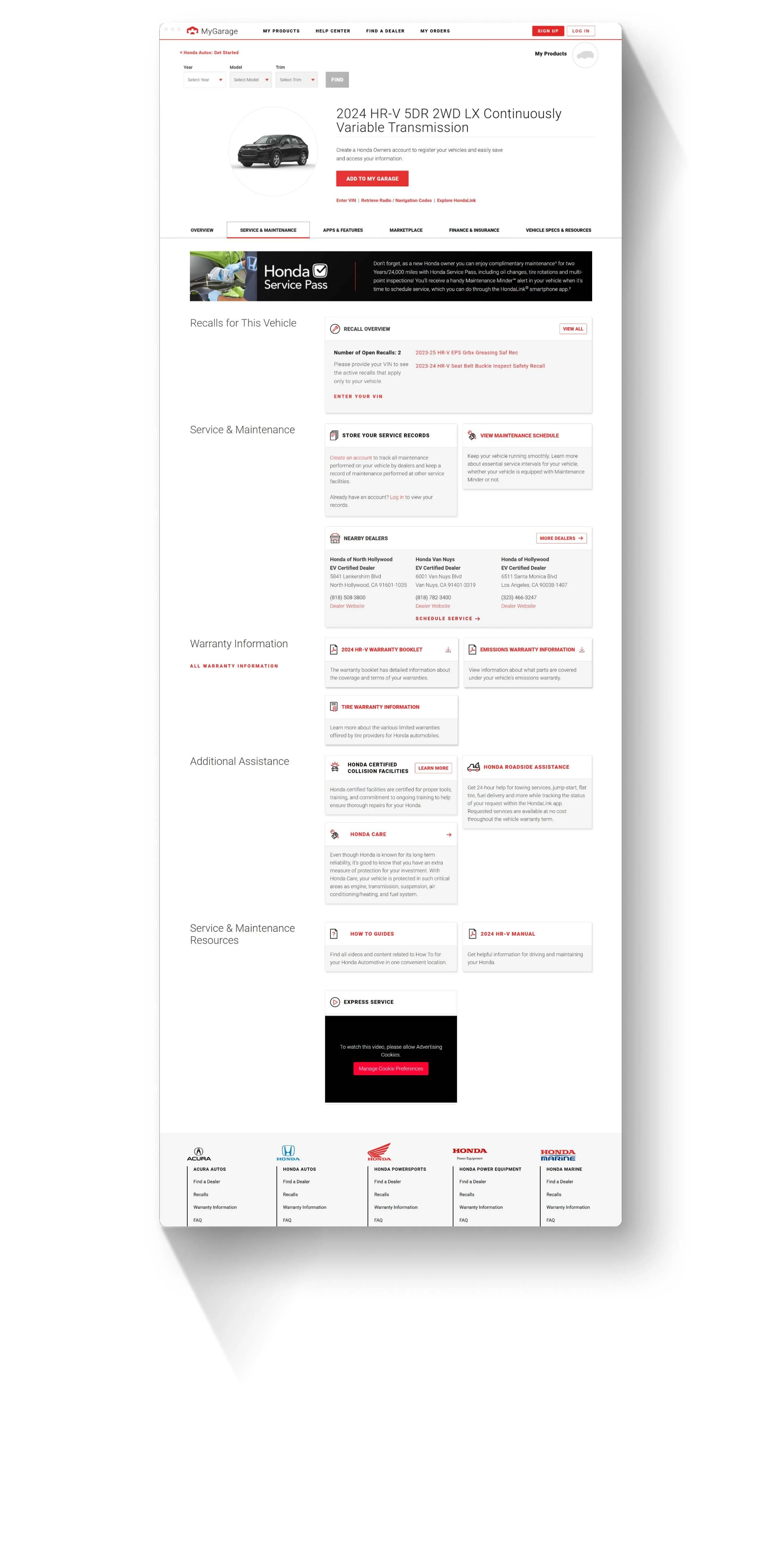
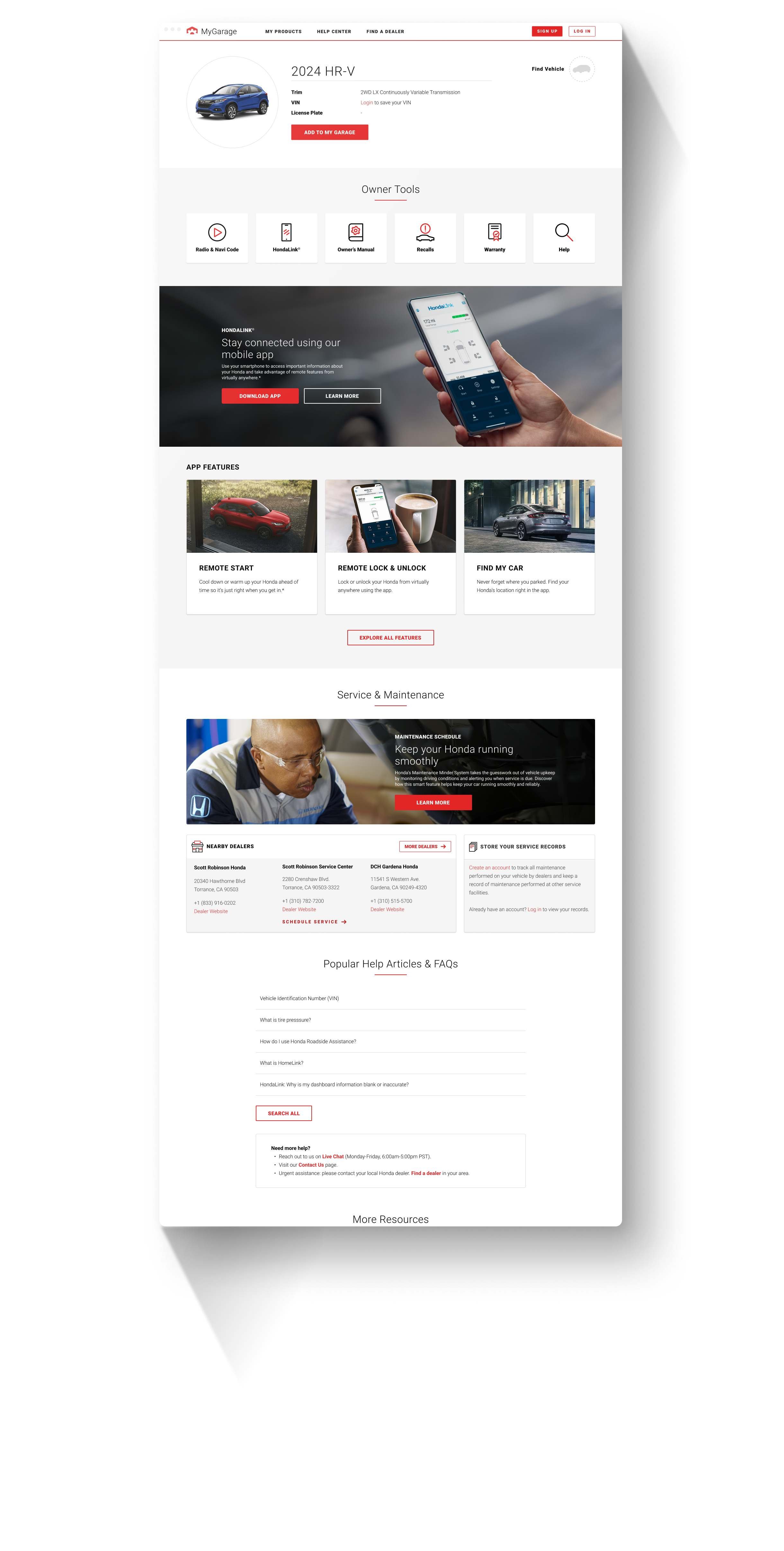
The high-traffic vehicle page is the main place for vehicle-specific content. But six tabs of duplicate information made the page feel fragmented and text-heavy.
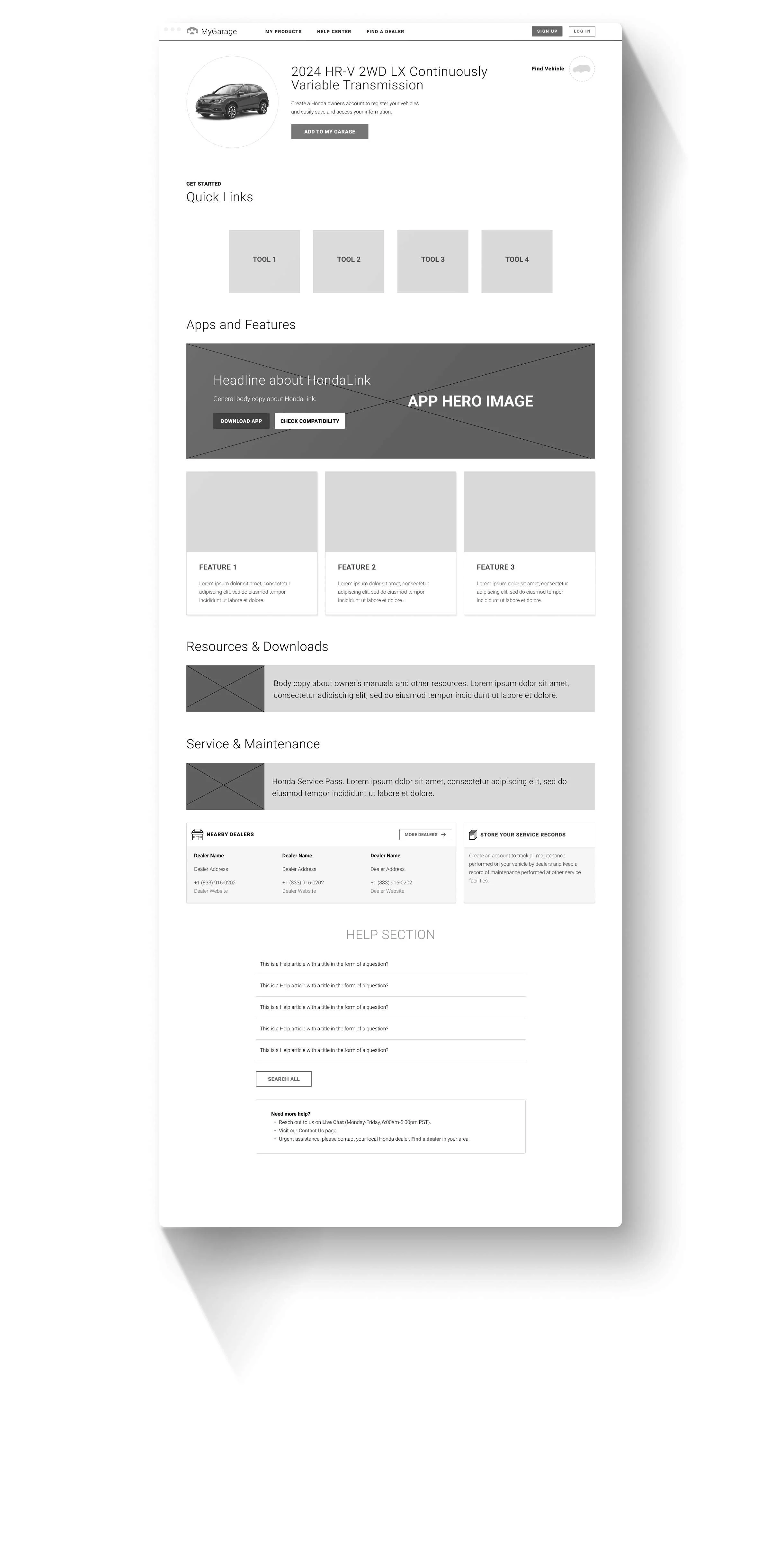
Much of the vehicle-specific content came from sources maintained by teams across the enterprise and some of it had shared purposes. That made reorganizing the experience more practical than changing the content itself. I replaced the old 6-tab navigation with a single, scannable page and reworked the information hierarchy. The most-used features moved higher on the page, while less frequently used content remained accessible below the fold. I also reduced the “wall of words” effect with imagery and other design elements to make topics easier to scan.
Vehicle Page Evolution
-
Legacy Vehicle Page
Users parsed through six tabs of duplicate text content with little information hierarchy to tell them what was important.
-
Mid-fidelity Wireframe
The idea was to surface the most important content in links at the top of a one-pager with lesser used content below.
-
Redesigned Vehicle Page
Redundant information was eliminated, key content prioritized, and imagery and white space used to improve scannability.
A gap between what the analytics showed and what users felt.
After launch, user feedback showed that service history and financial services links were still difficult to find. Traffic analytics had shown low usage for both, but they were among the most common survey frustrations.
Low usage didn’t necessarily mean low importance. Users might only use these features occasionally, but they still wanted to find them when they needed them. I gave them more prominence in the page hierarchy and analyzed the service history journey to shorten it based on the user’s entry point and authentication status.
The research pointed to several more opportunities to improve key tasks.
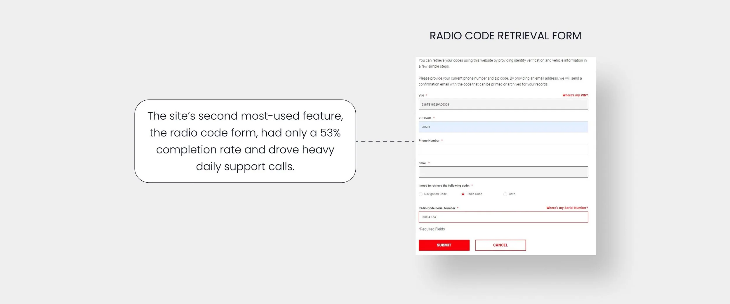
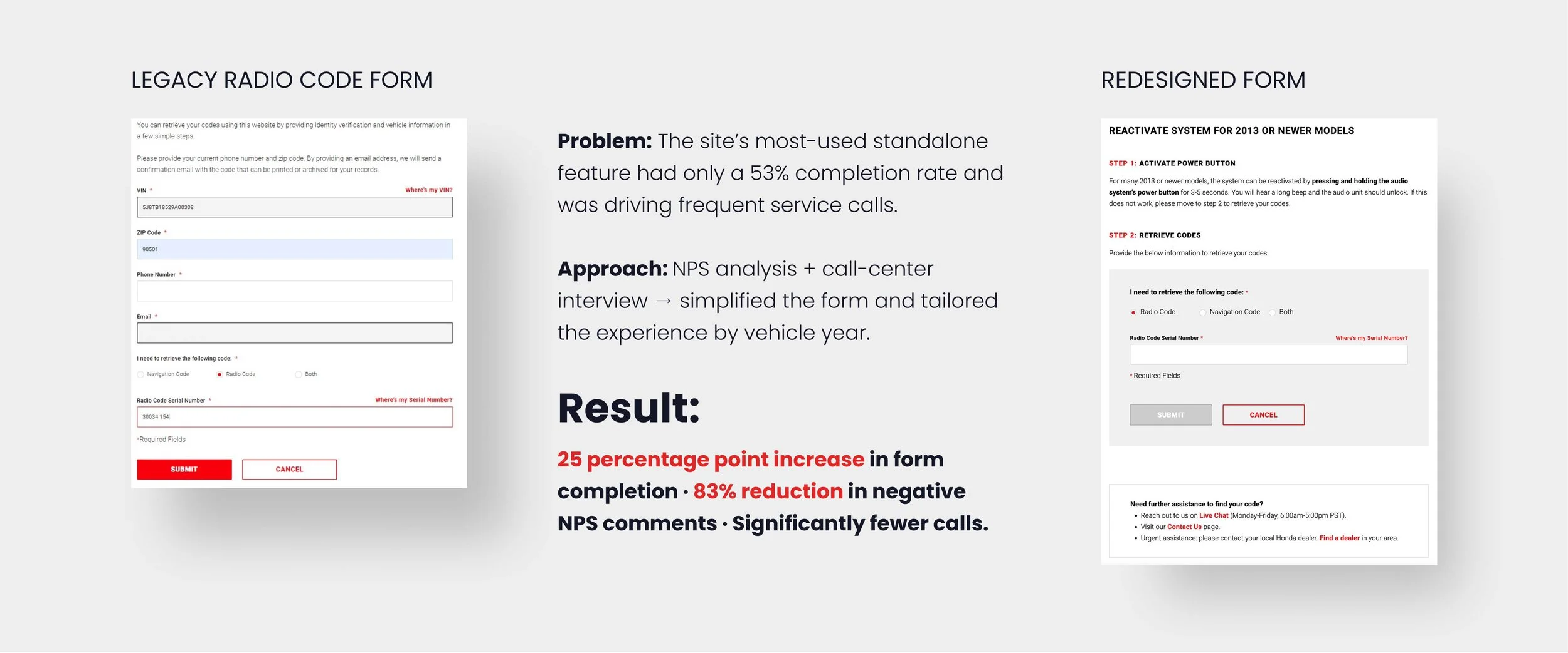
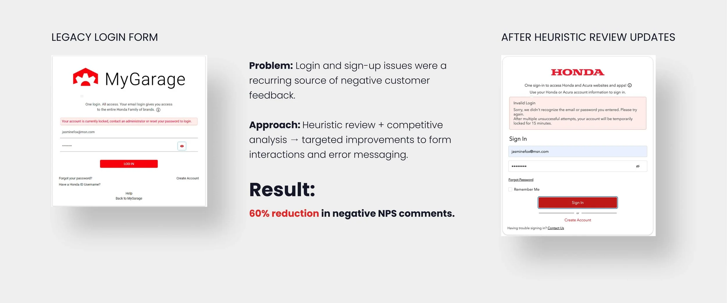
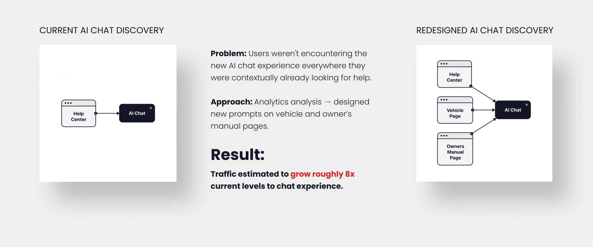
Users were frustrated with several high-traffic tasks, including recalls tracking, radio code retrieval, authentication, and AI chat access. I focused on making these interactions easier to complete and helping customers find the support they needed.
Improving Task Completion
-
![]()
Radio / Navigation Code
Why can’t I turn my radio and navigation system on?
-
![]()
Log In / Sign Up
Why is it so hard to log in?
-
![]()
AI Chat Discovery
How can I get a quick answer to a specific question?
Looking ahead
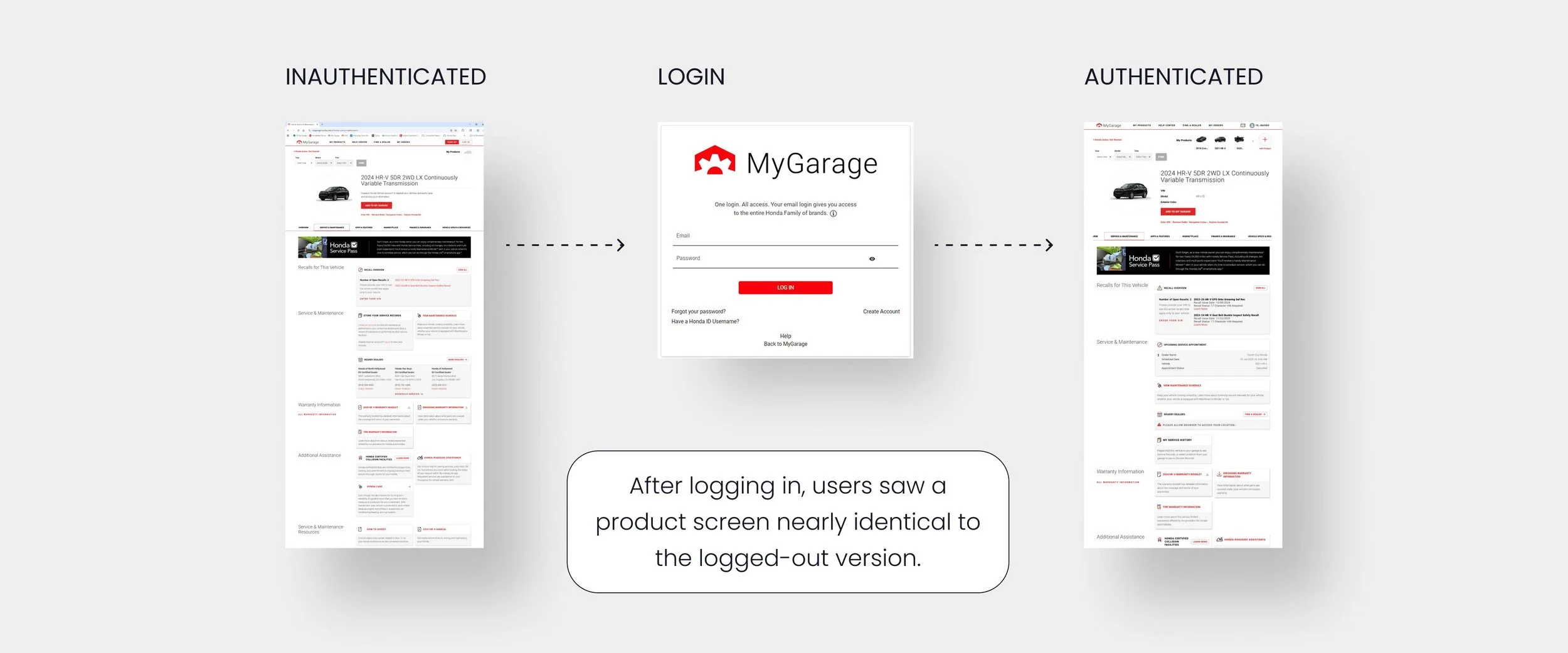
Owners expected to log in to see personalized information. But the logged-in and logged-out experiences look nearly identical. Personalized content is there, but it is easy to miss, making it unclear what logging in actually provides.
I explored a dashboard-style experience to make the difference between authentication states more obvious. The distinct UI keys users into their logged-in status and brings personalized vehicle information forward immediately after onboarding with a VIN.
The dashboard is still a concept, but it would make a more useful and personalized logged-in experience for MyGarage.
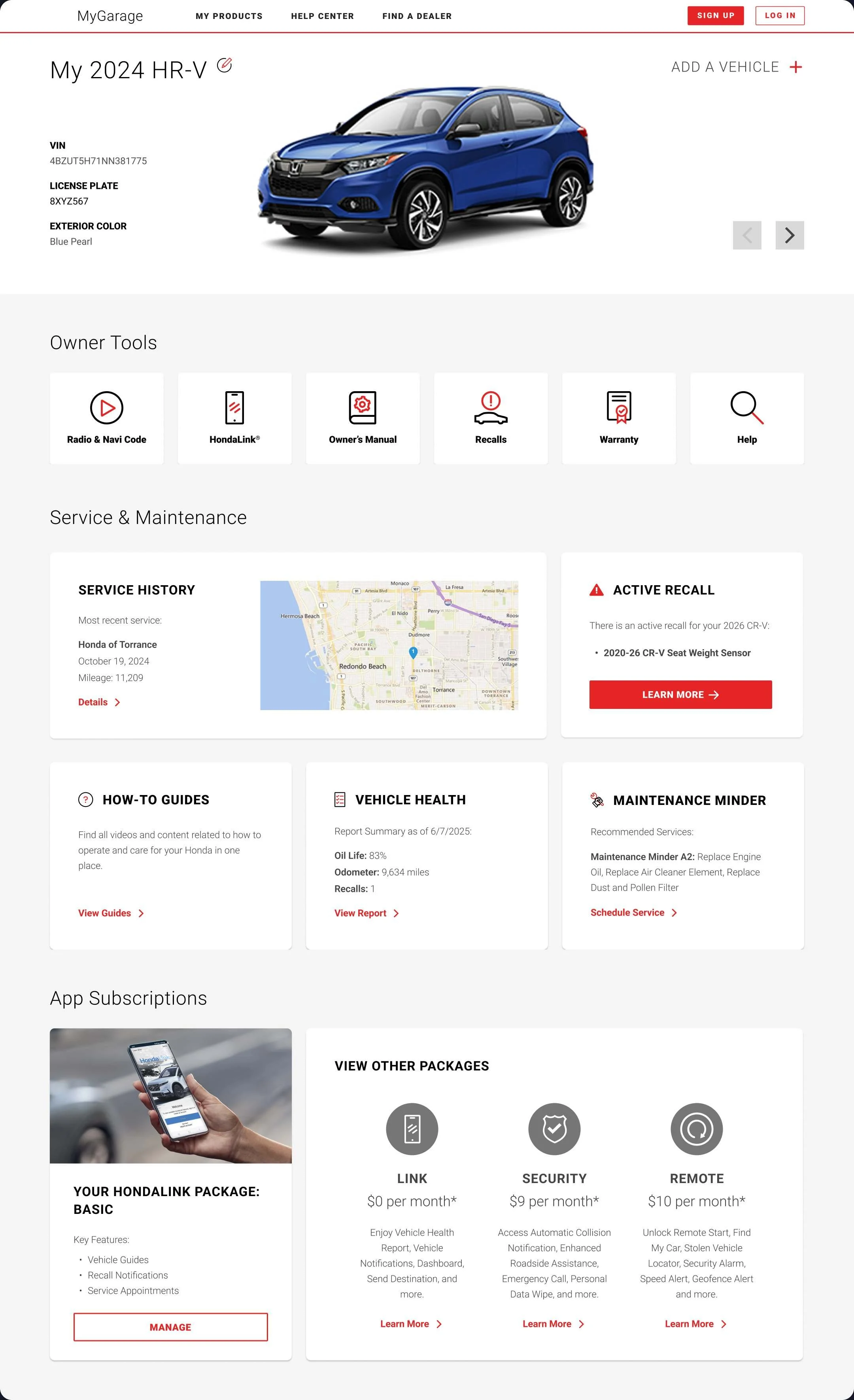
DASHBOARD CONCEPT (EXPLORATORY)
The Impact of Targeted Design
Working within constraints shaped how I approached this work. With a newly launched product, limited resources, and five brands sharing the same experience, a full redesign wasn't the right solution. The research helped identify where targeted changes could have the biggest effect, and the post-launch feedback showed where the data needed more context.
The result for the site was a 47 point increase in NPS. And I came away with a better understanding of where design could have the most impact within an already established product.
Need a UX designer?