WARNER BROS.
Designing a scalable experience for film marketing content
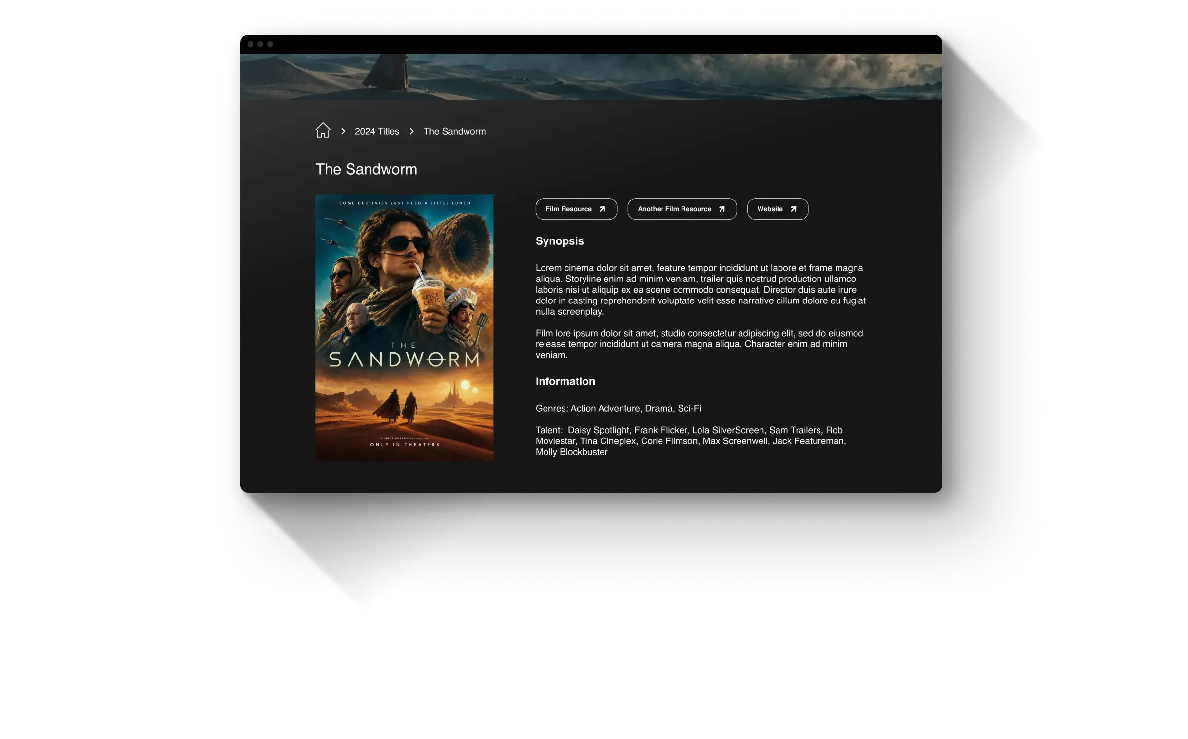
*Visual & copy adapted to remove confidential or copyrighted content
An internal marketing website created to bring film content, insights, and resources together in one centralized experience.
ROLE: PRODUCT DESIGNER
I collaborated with a lead designer on strategy and wireframes. After they left the project, I became the sole designer, taking the work through high-fidelity design, prototyping, stakeholder review, design-system development, and developer handoff.
TIMEFRAME
2 Months
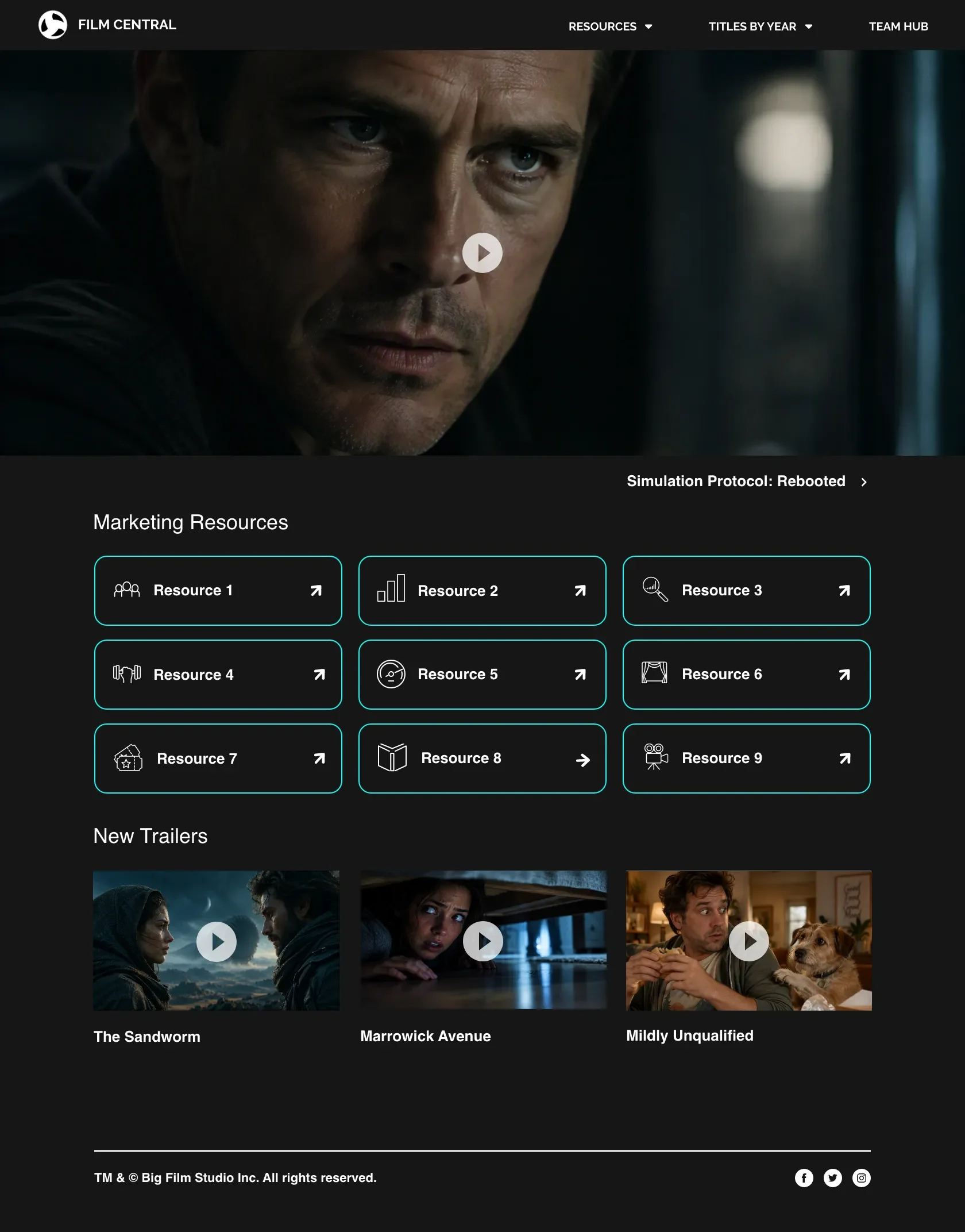
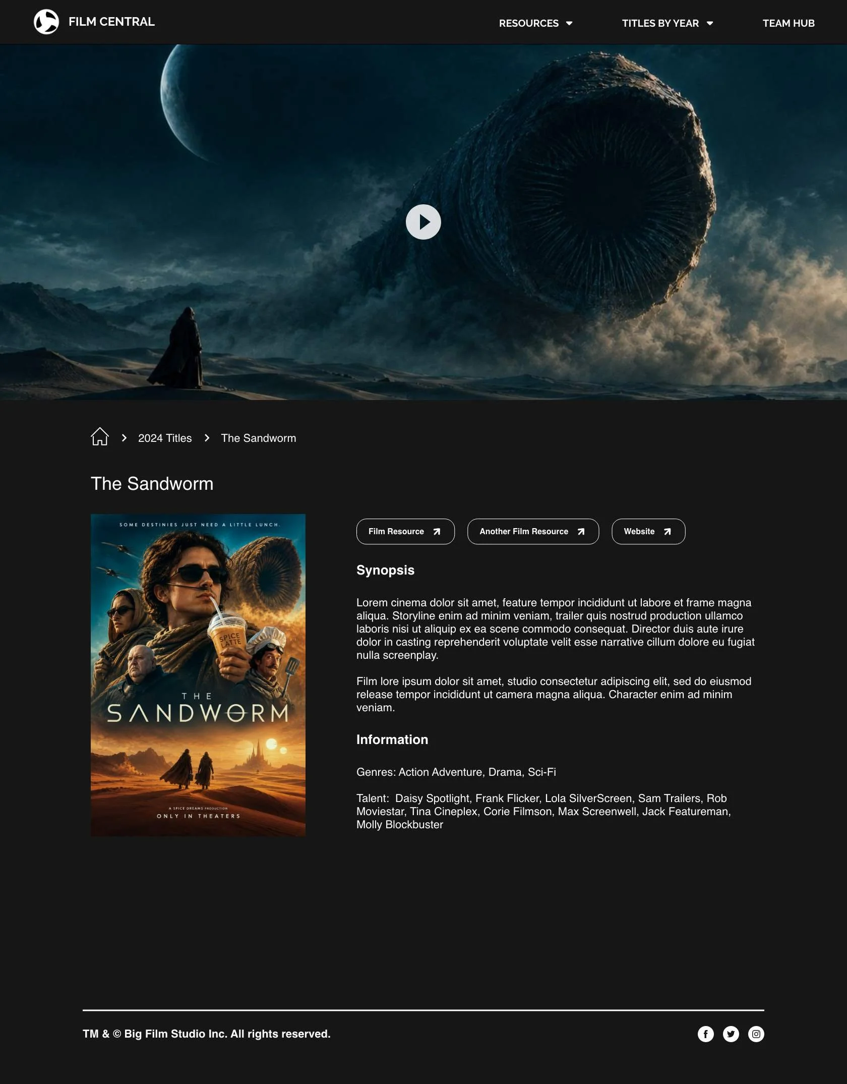
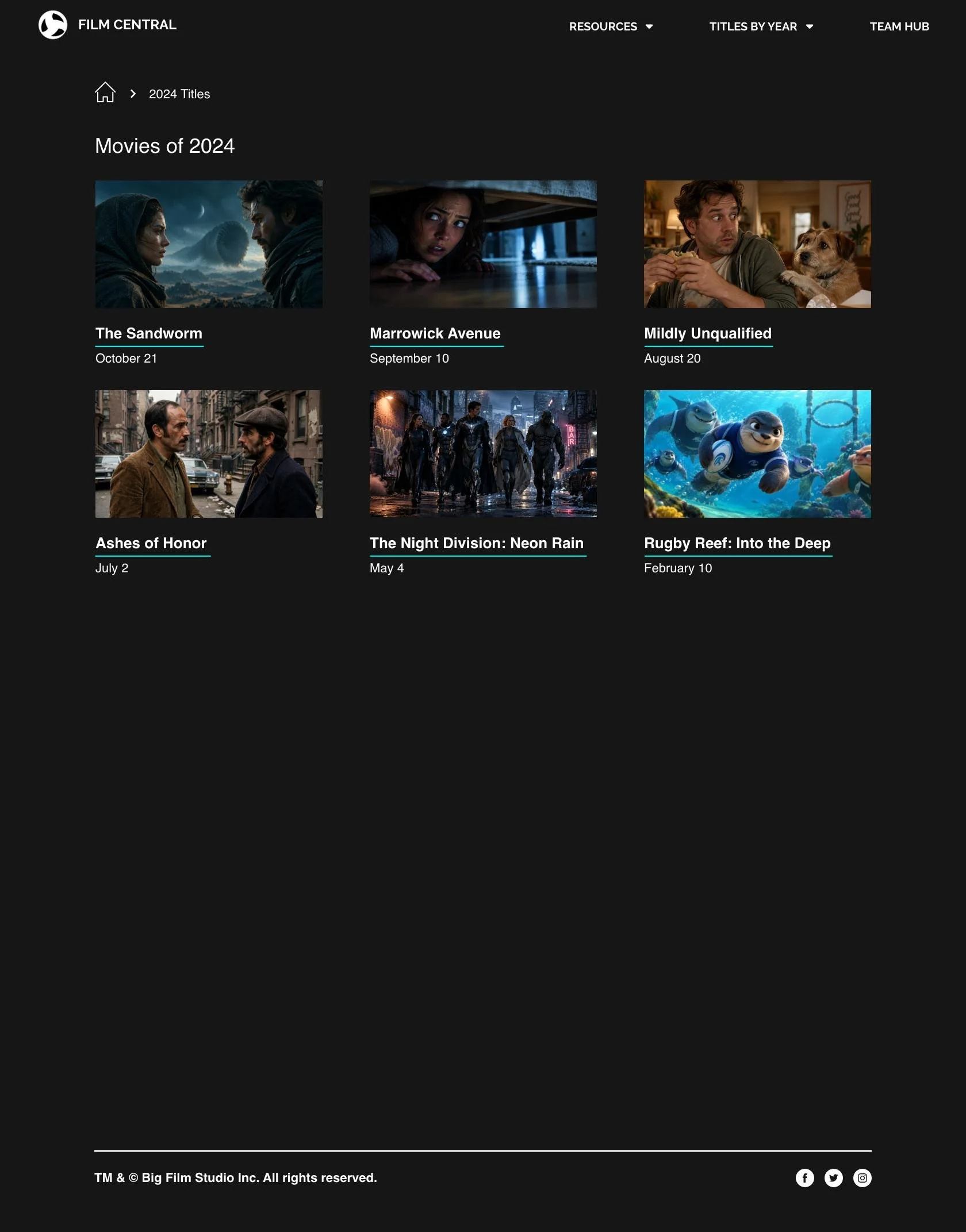
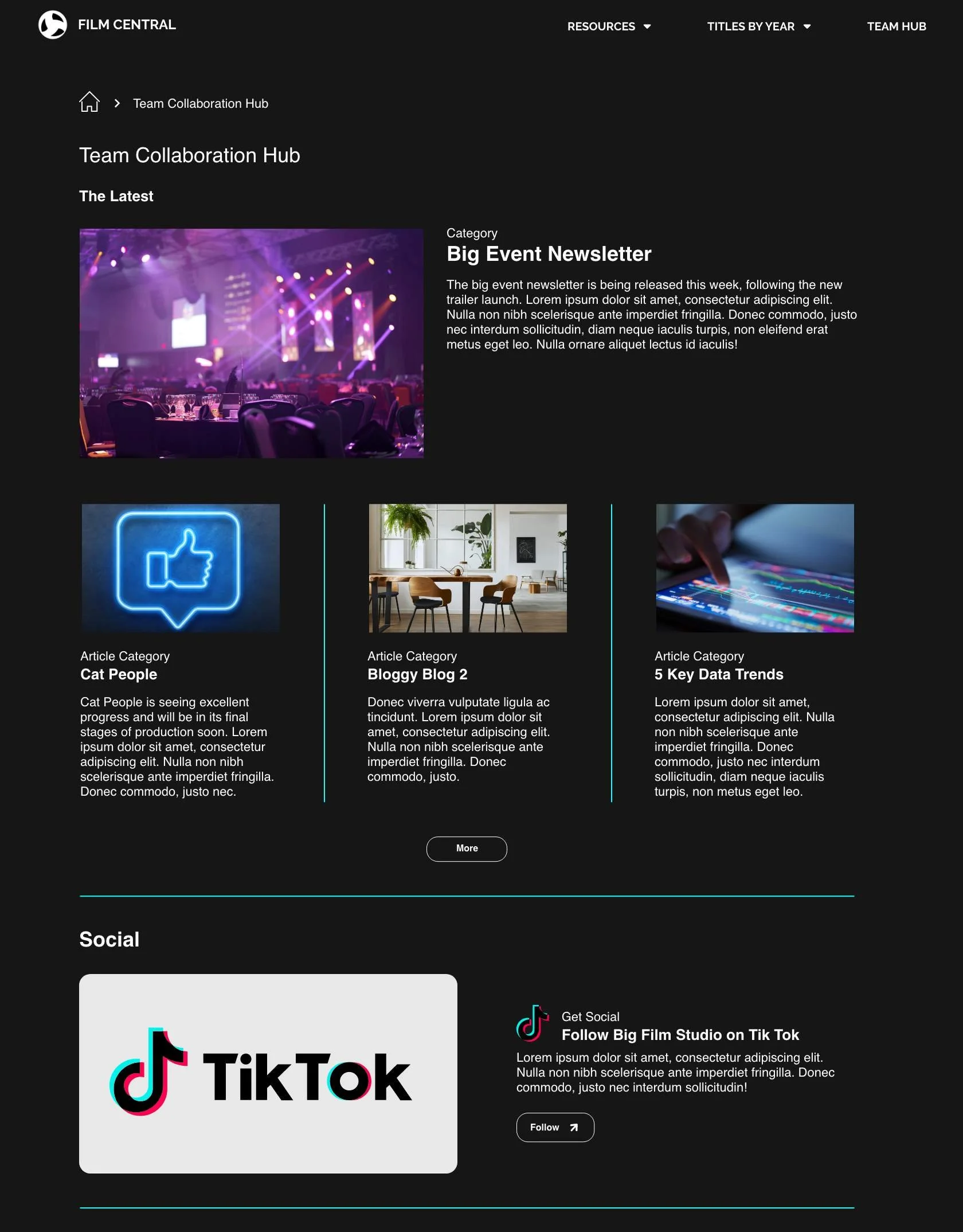
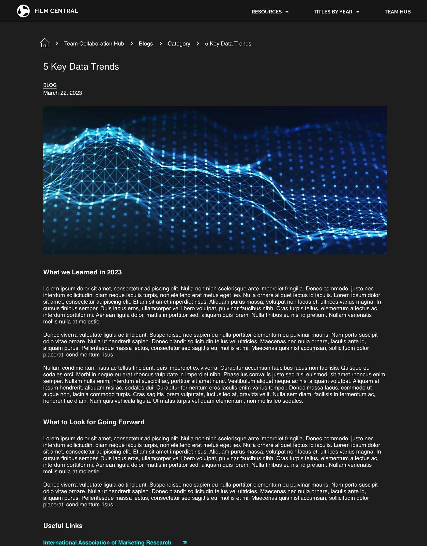
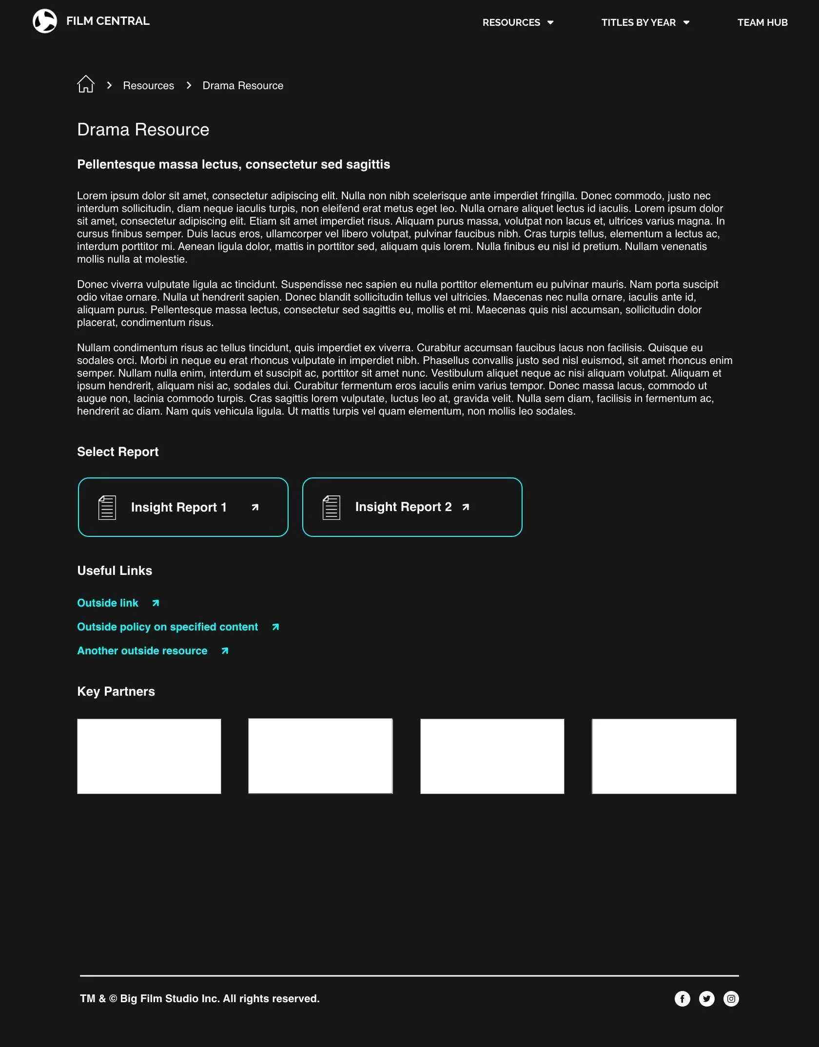
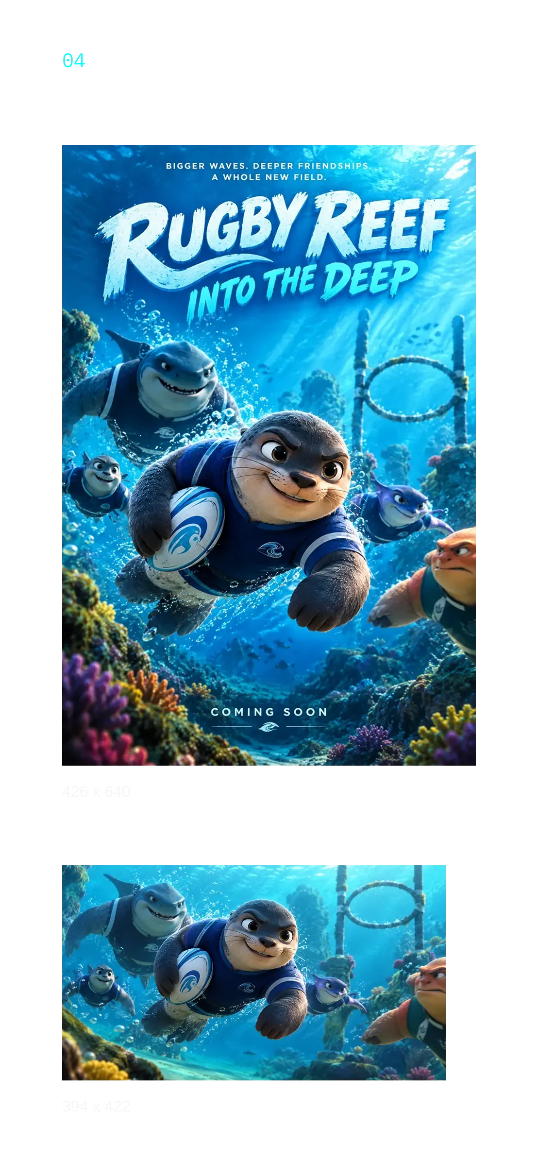
*Visuals & copy adapted to remove confidential or copyrighted content while preserving the original design direction and UI. Film imagery is AI-generated for illustrative purposes.
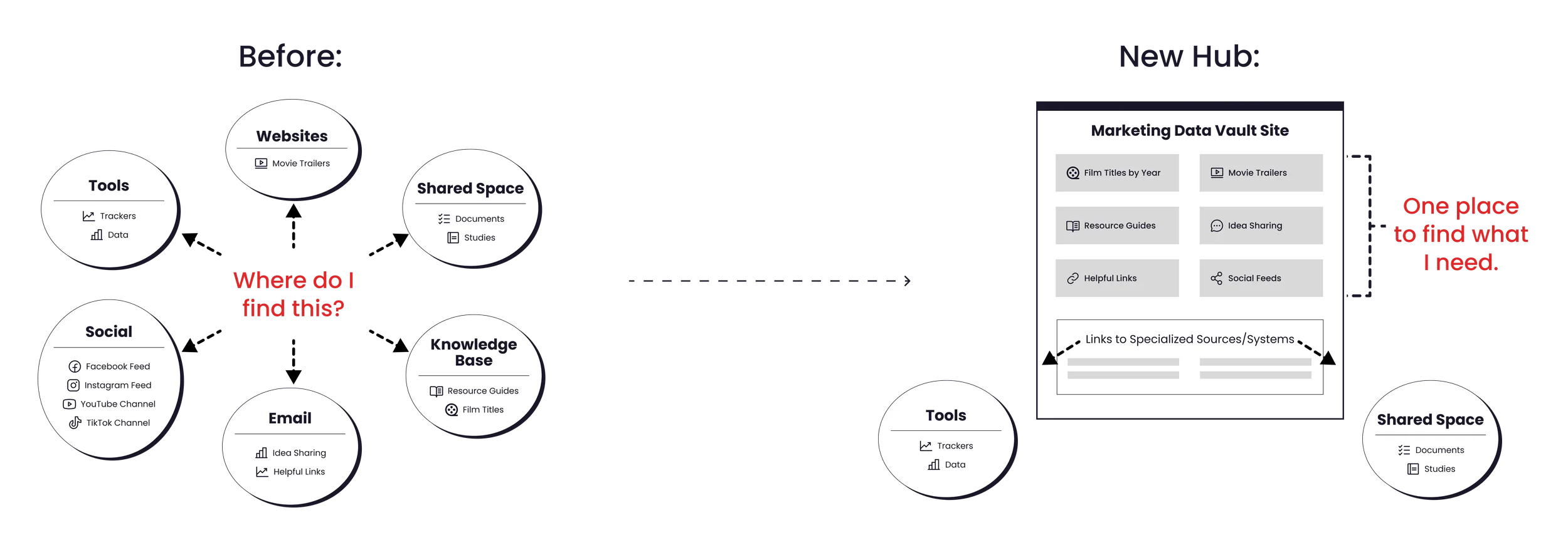
Marketing teams relied on multiple platforms for film content, marketing insights, and internal resources.
They needed one place to start when looking for information or communicating with stakeholders. After inventorying the full scope of content, we decided that not everything needed to move into a new site. Some resources served a specific purpose or already worked well where they were. Rather than recreate them, the design made them easier to find from one central hub.
The design had to support scaling as the library of films and related content would continue to grow.
Film content spanning multiple decades, guides, articles, and other supporting resources all needed a place in the site. We used reusable templates for recurring page types, while designing custom layouts for key destinations like the homepage and the team collaboration section.
This gave the team a practical way to add content over time without making every page look or work the same.
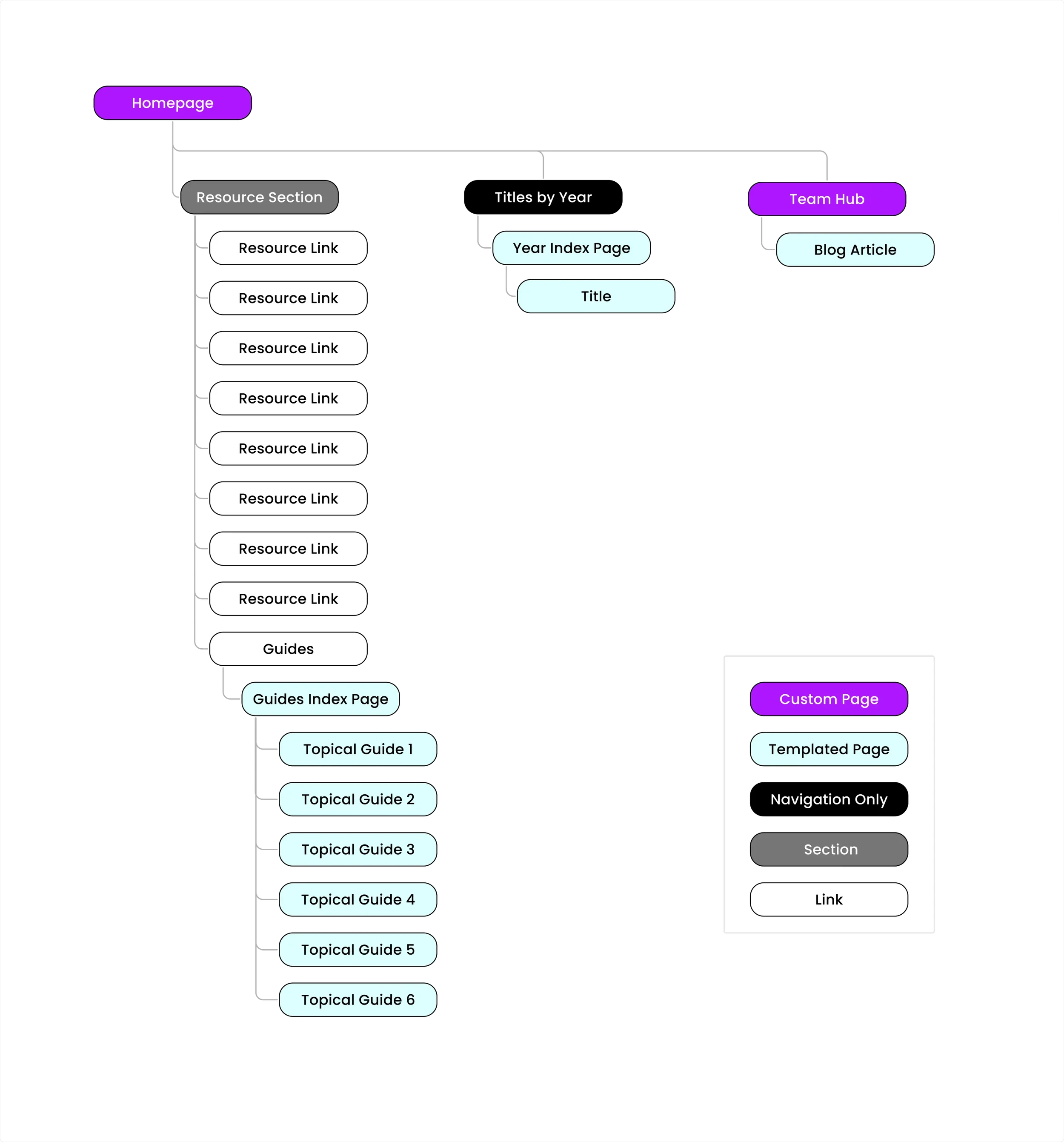
SITE MAP
Custom & Templated Page Examples
-
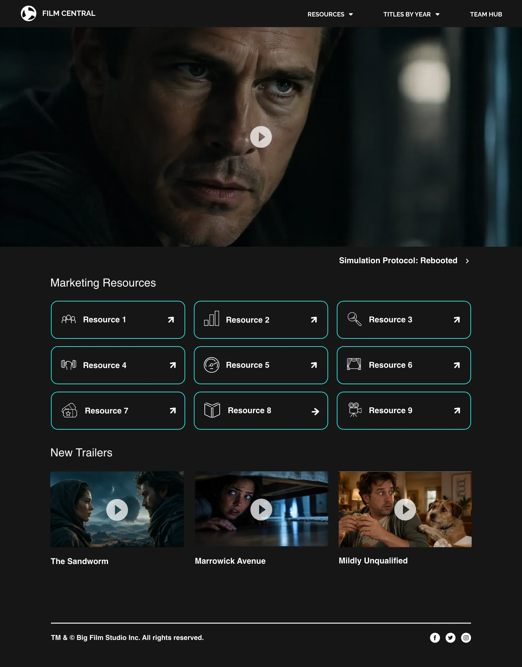
Custom: Site Homepage
This page brought together different types of content and pointed users toward key areas of the site.
-
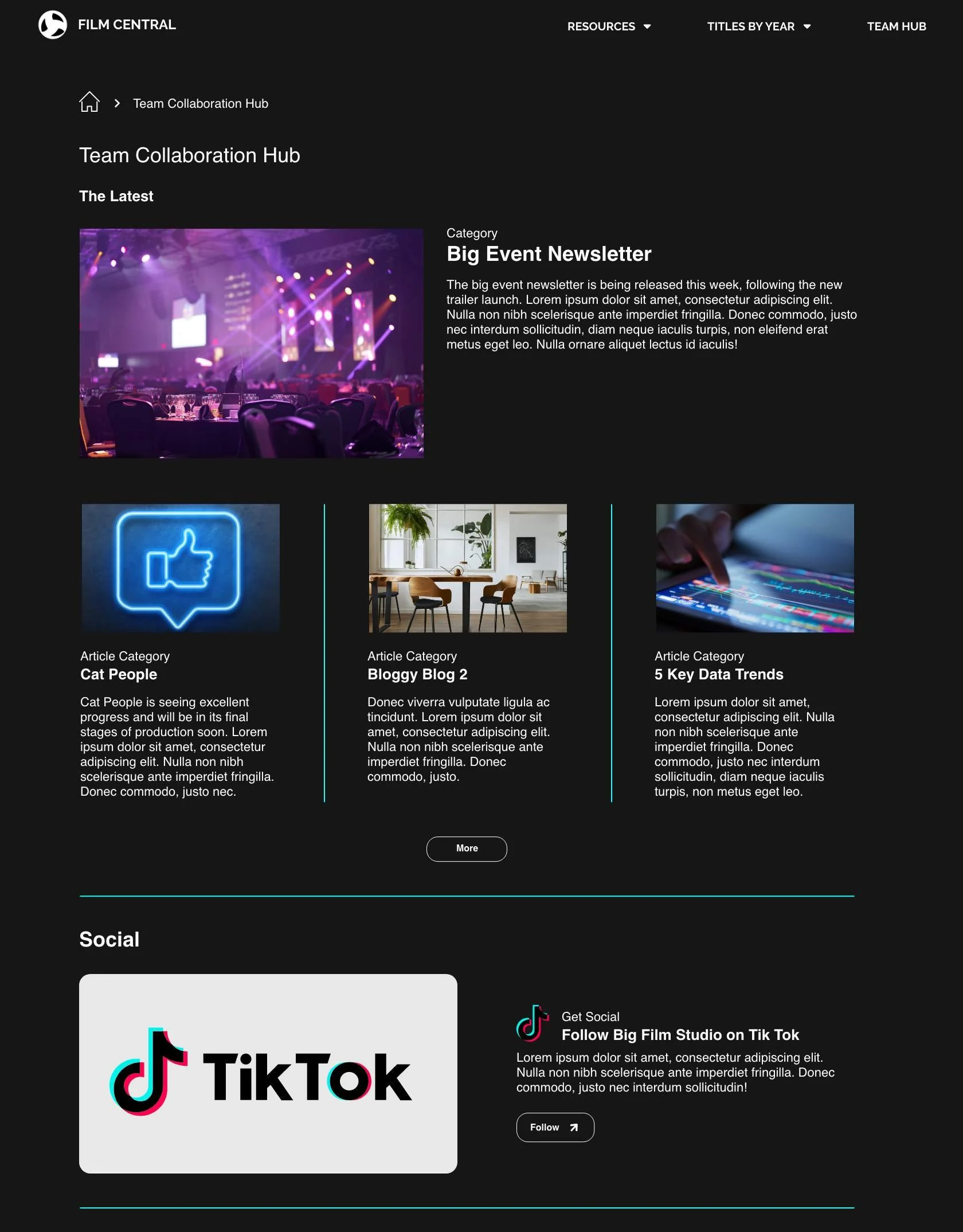
Custom: Collaboration Hub
A dedicated layout gave the team a central place for collaboration, with a structure suited to its specific needs.
-
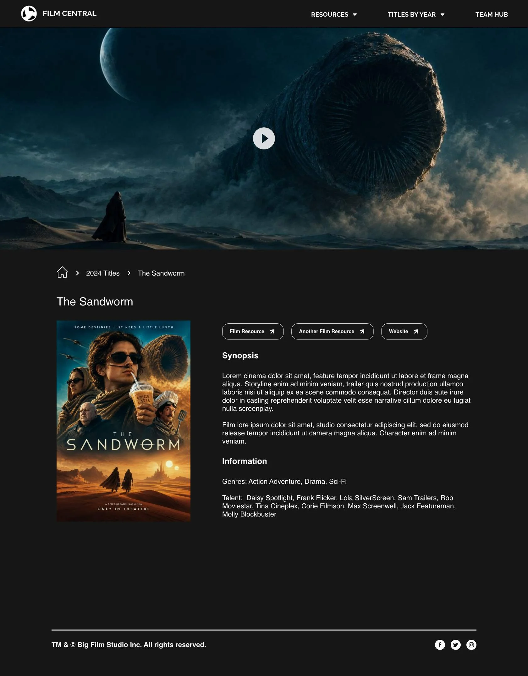
Templated: Film Detail Page
A repeatable layout kept film details consistent while making it easier to add titles across different years.
-
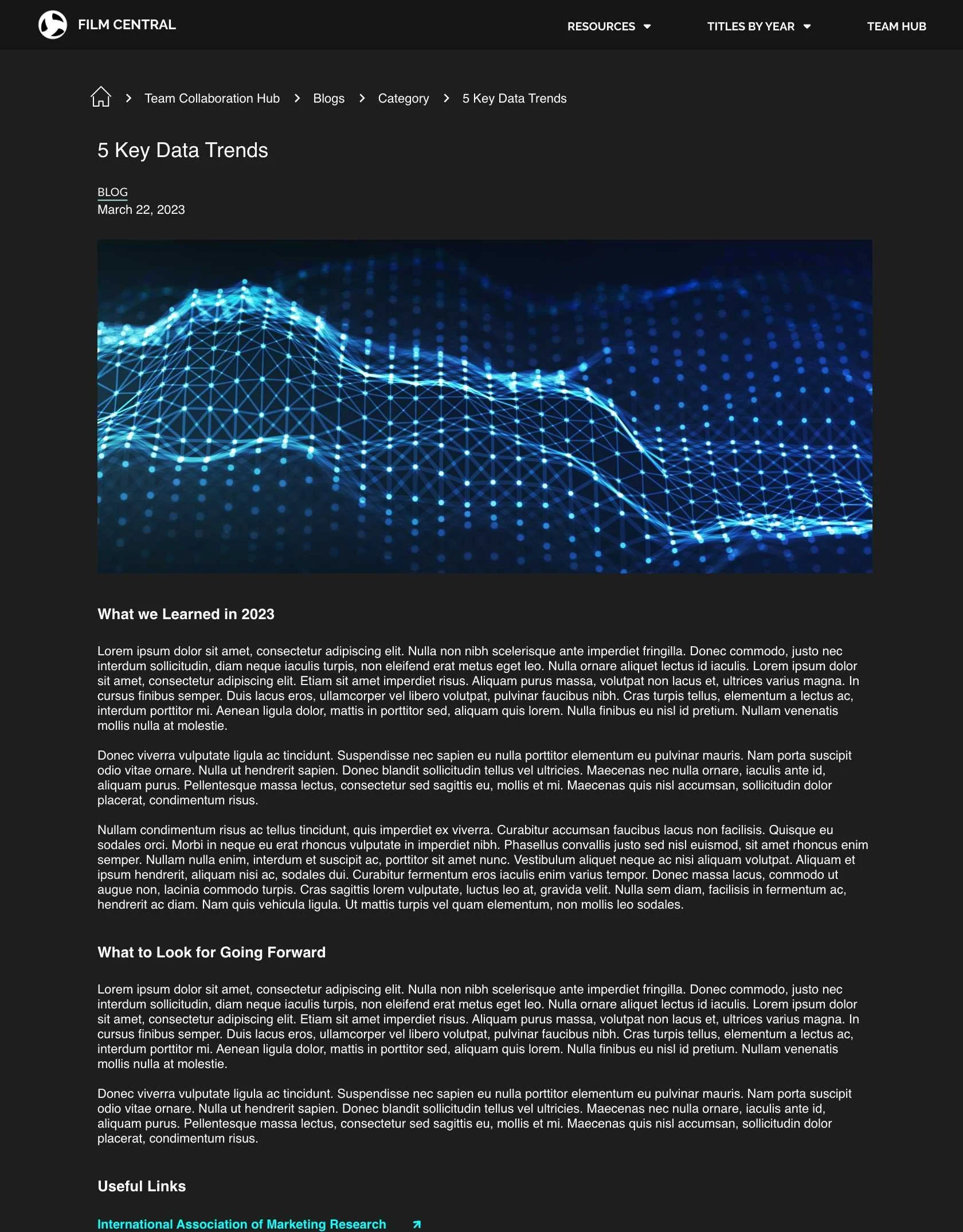
Templated: Blog Article
A shared article template provided a consistent structure without requiring a new layout for each piece.
The visual system needed to make a lot of different content feel like part of the same experience.
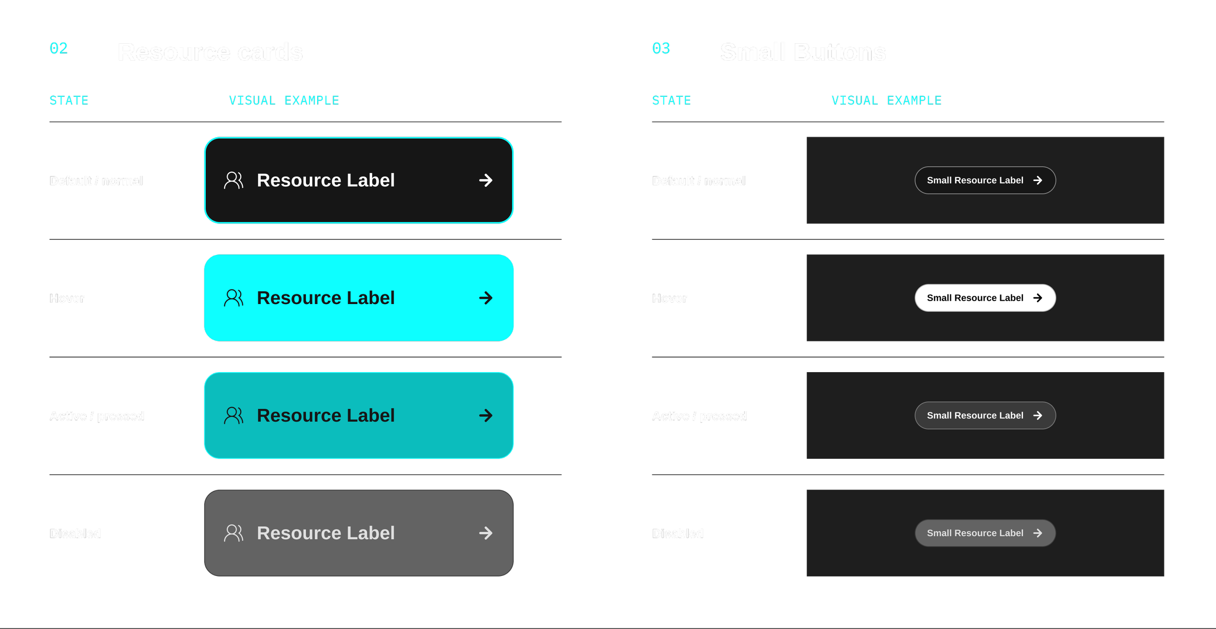
I followed the look and feel of the company's broader digital properties, using a dark theme, film imagery, and reusable components. Within that shared style, each page used a different approach. Film pages gave more space to trailers and imagery, while index pages used consistent card layouts to make larger collections easier to scan. Hierarchy, spacing, and icons helped organize the content and show users what they could expect from each item.
Design System

The experience was ready to move from design into development.
After I designed the high-fidelity UI, I built an interactive prototype and presented the experience to business stakeholders. The feedback was overall positive, and I incorporated some requests before organizing the final designs, prototype, and reusable component library for developer handoff. My contract ended shortly afterward, so I wasn't able to follow the implementation or evaluate the experience with end users.
The handoff delivered a cohesive, scalable design foundation that brought the team's content and resources into one experience, with reusable patterns to support future growth.
Need a UX designer?