Evaluating a redesigned intranet menu through usability testing
A usability study of a redesigned corporate intranet menu to identify navigation issues and inform design improvements.
ROLE: USABILITY TEST LEAD
I led usability testing for a redesigned corporate intranet navigation menu, bringing prior usability testing experience to evaluate a prototype. I also facilitated findings synthesis with the UX team and developed a report translating usability issues into actionable recommendations.
TIMEFRAME
2 Months
A corporate intranet served a diverse workforce with different roles and information needs.
Its mega menu attempted to accomodate everyone, but it was large and difficult to navigate, making it hard for employees to find the information they needed. The UX Design team worked with stakeholders to develop a redesigned menu prototype with a more intuitive information architecture. I joined the project shortly afterwards and help with next steps to evaluate whether the new structure actually made navigation easier for employees.
We wanted to understand how employees navigated the new menu.
I moderated remote usability tests with eight employees representing a range of roles and familiarity with the intranet. Participants worked through information-seeking tasks across all six menu categories while thinking aloud and explaining their choices.
The tasks helped us evaluate how people interpreted menu labels, where they expected to find information, and how easily they could locate the right destination. We looked beyond whether participants eventually found a link and noted where the menu created confusion or slowed them down.
-

Tools & Support
Example Question: You've forgotten your password. Where would you go for help?
-

Company News & Events
Example Question: You missed a company-wide meeting. Where would you go to find a recording?
-

Culture & Values
Example Question: Where would you look for information about the company's inclusion initiatives?
-

Employee Information
Example Question: You need the latest information about workplace policies. Where would you look?
-

Learning & Development
Example Question: You're interested in taking a leadership course. Where would you look for more information?
-

Employee Communities
Example Question: You're interested in joining an employee group. Where would you look?
*Menu categories and task prompts have been generalized to protect internal company information while illustrating the testing approach.
After the test sessions, I led a team review of our findings.
We grouped similar observations and recorded the frequency at which each issue arose and also agreed on the impact it had on the user’s ability to find what they needed. The aim was to identify the most common problems with the highest impact in order to decide which ones needed the most attention.
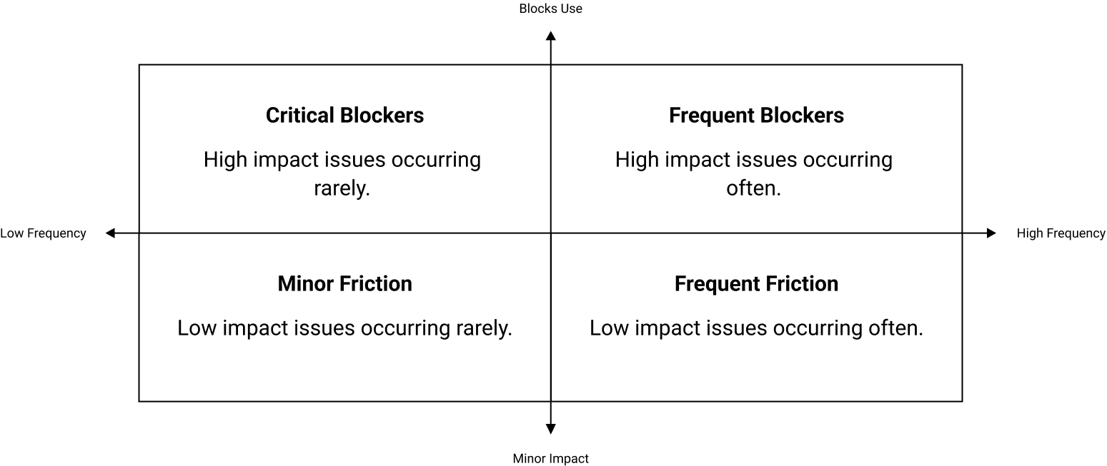
DATA VISUALIZATION
The findings helped us realize that reorganizing the menu alone wasn't impactful enough to ease user’s frustration.
Employees needed to be able to scan each section quickly, pick out the links they were looking for, and understand where each link would take them without having to stop and interpret lengthy or unclear descriptions.
Key Pain Points:
-
Four of seven participants said the tabbed submenus felt overwhelming because of the amount of text. Several spent more than 10 seconds reading a submenu.
-
Participants often searched across three or more submenus to find links they expected to locate more easily.
-
Four of seven participants said they couldn't tell what many link labels referred to.
Rather than propose a separate fix for every issue, we identified design changes that could improve the experience across the menu.
Users had experienced issues finding desired links across a broad range of the main menu. Our recommendations focused on making content easier to scan, reducing unnecessary reading, and helping employees understand where each link would take them.
Recommendations
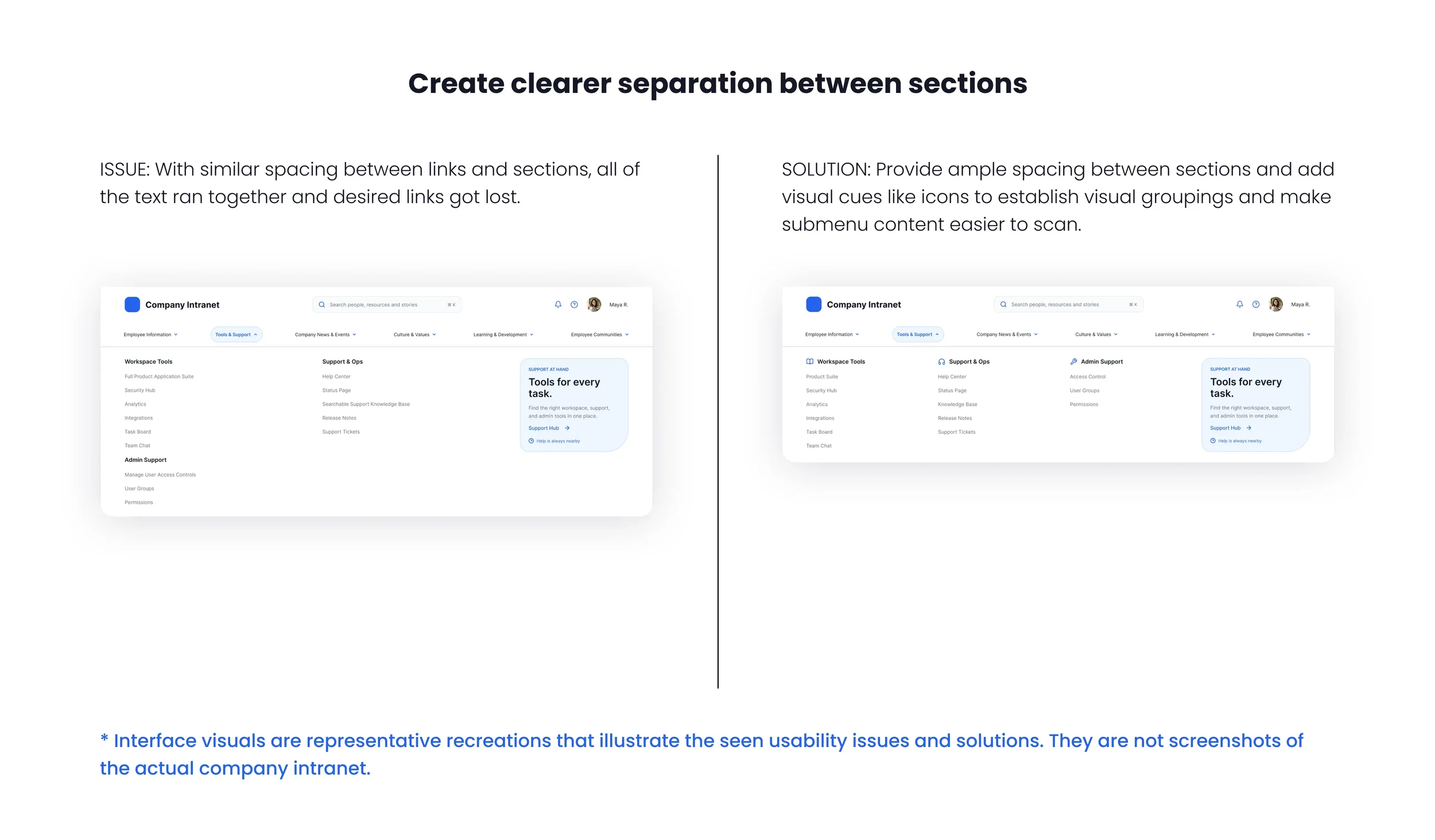
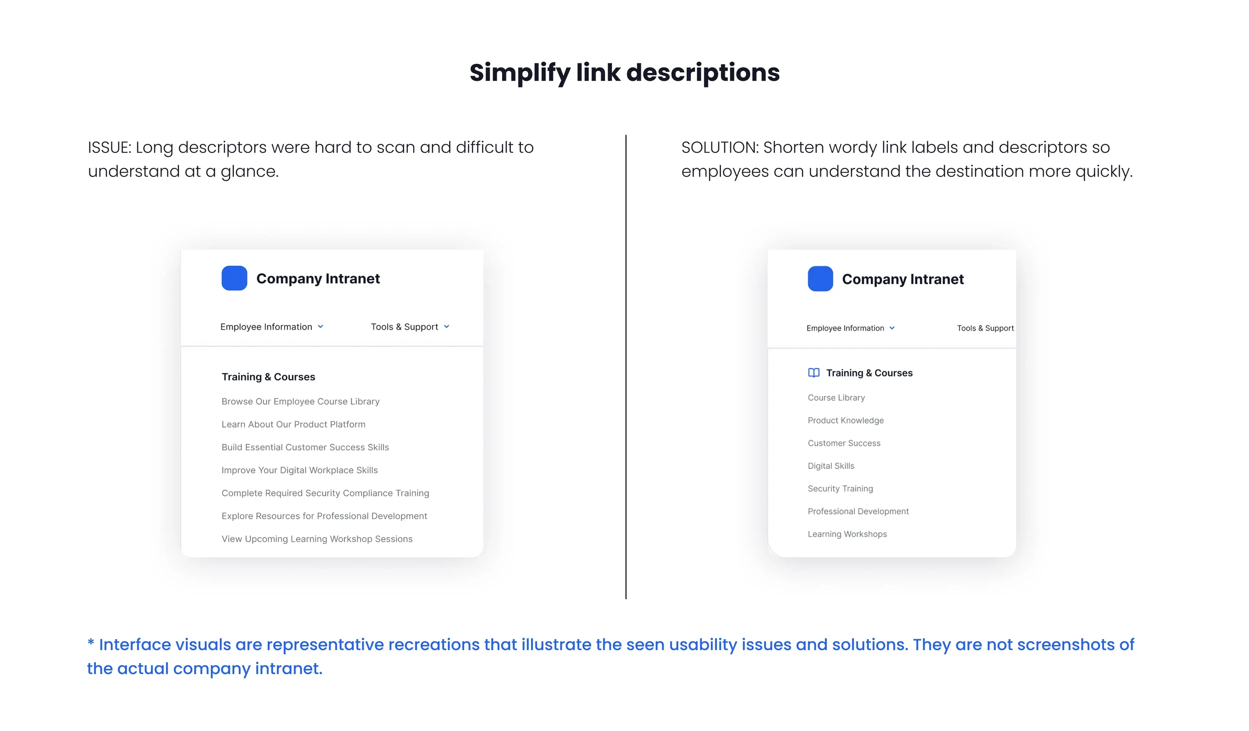
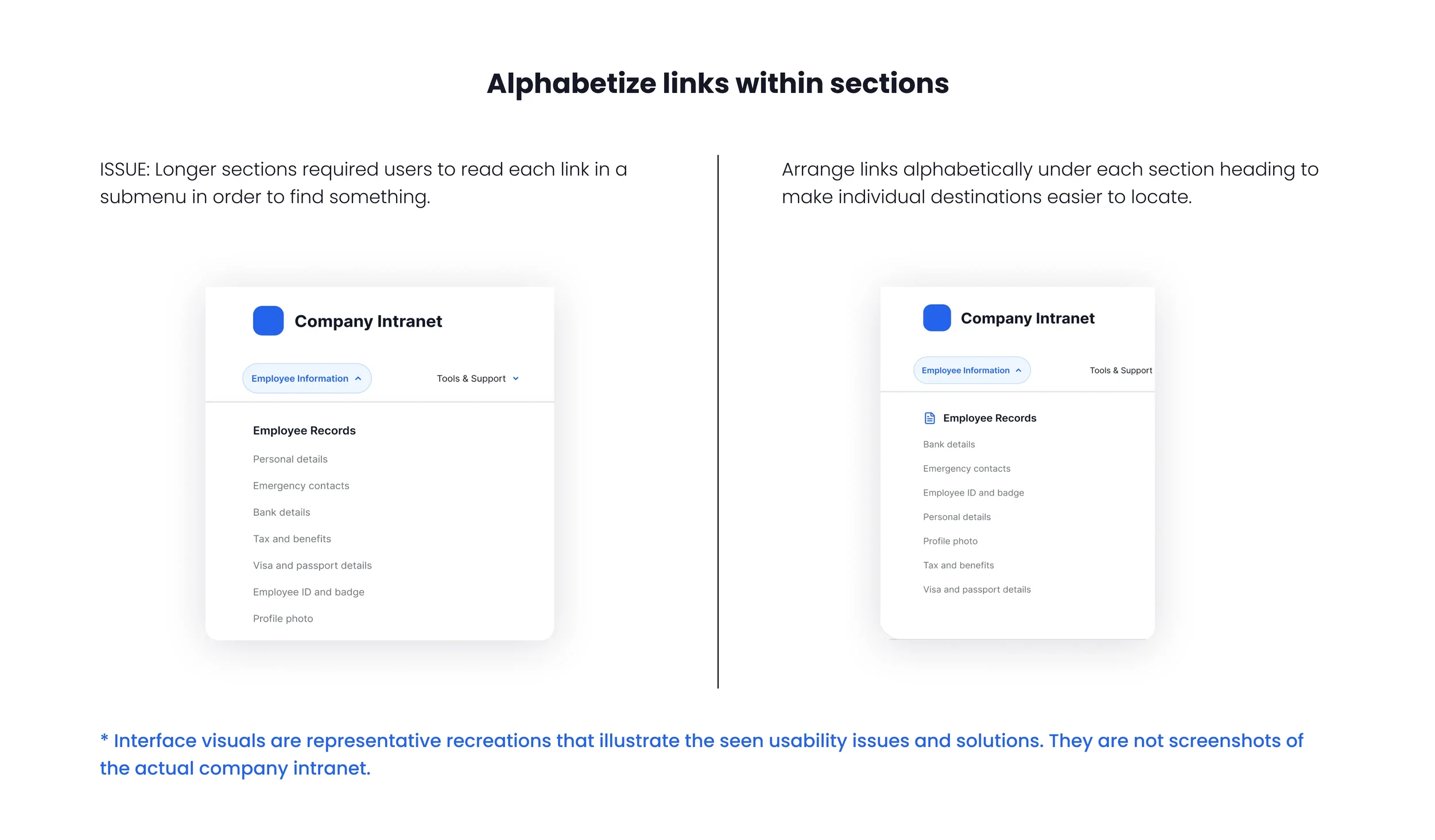
After reviewing solutions with the design team, I documented our findings and recommendations in a usability study for stakeholders.
The report explained not only what participants struggled with, but also why the issues mattered and how the recommended changes could improve the experience. While I developed the report, other designers worked in parallel to update the prototype with the proposed changes.
A closer look at the study
-
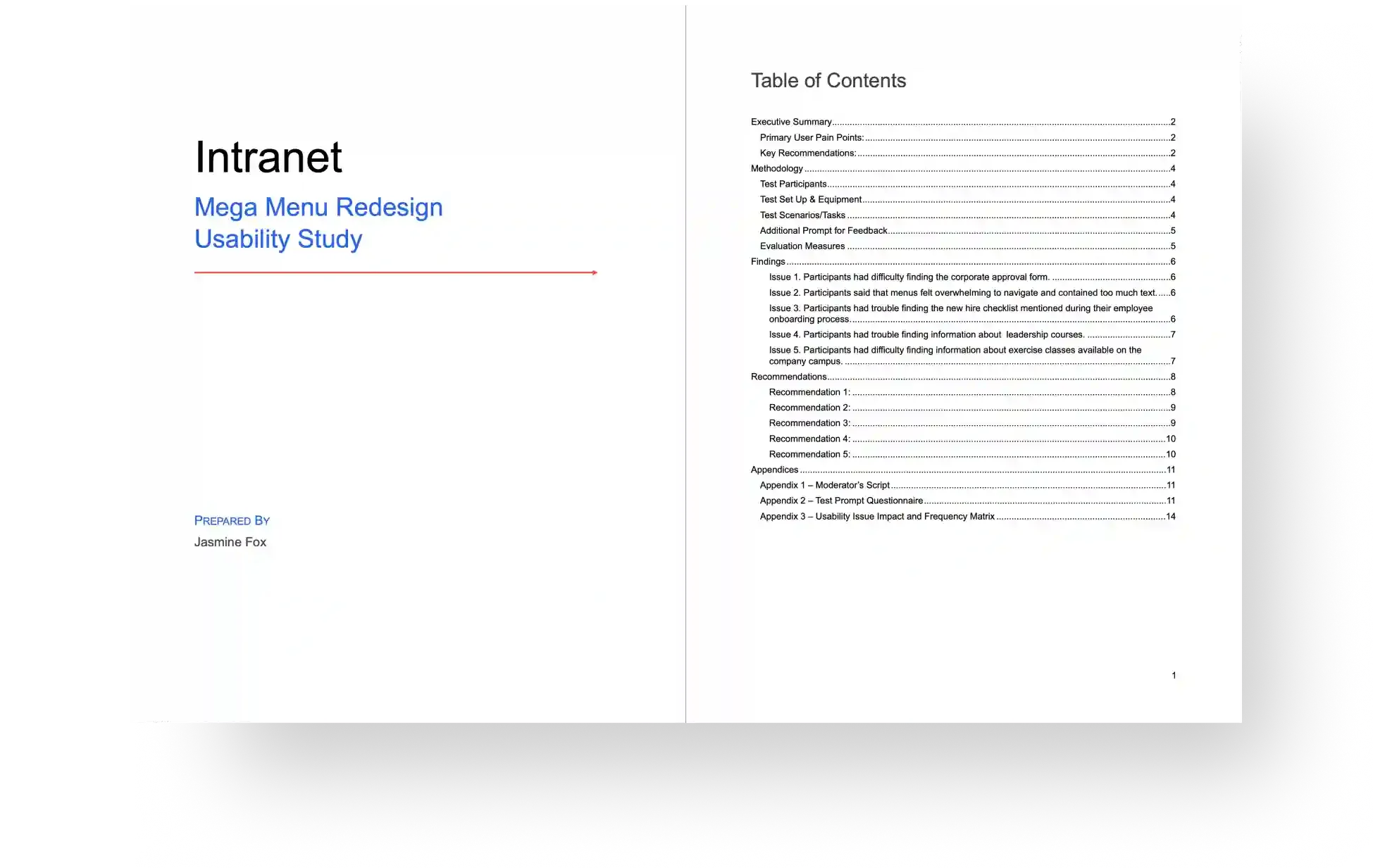
![Report title and index page screenshot]()
From Findings to Recommendations
The study detailed key pain points together with the reasoning for our recommendations. It also described test methodology and evaluation measures for those interested.
-
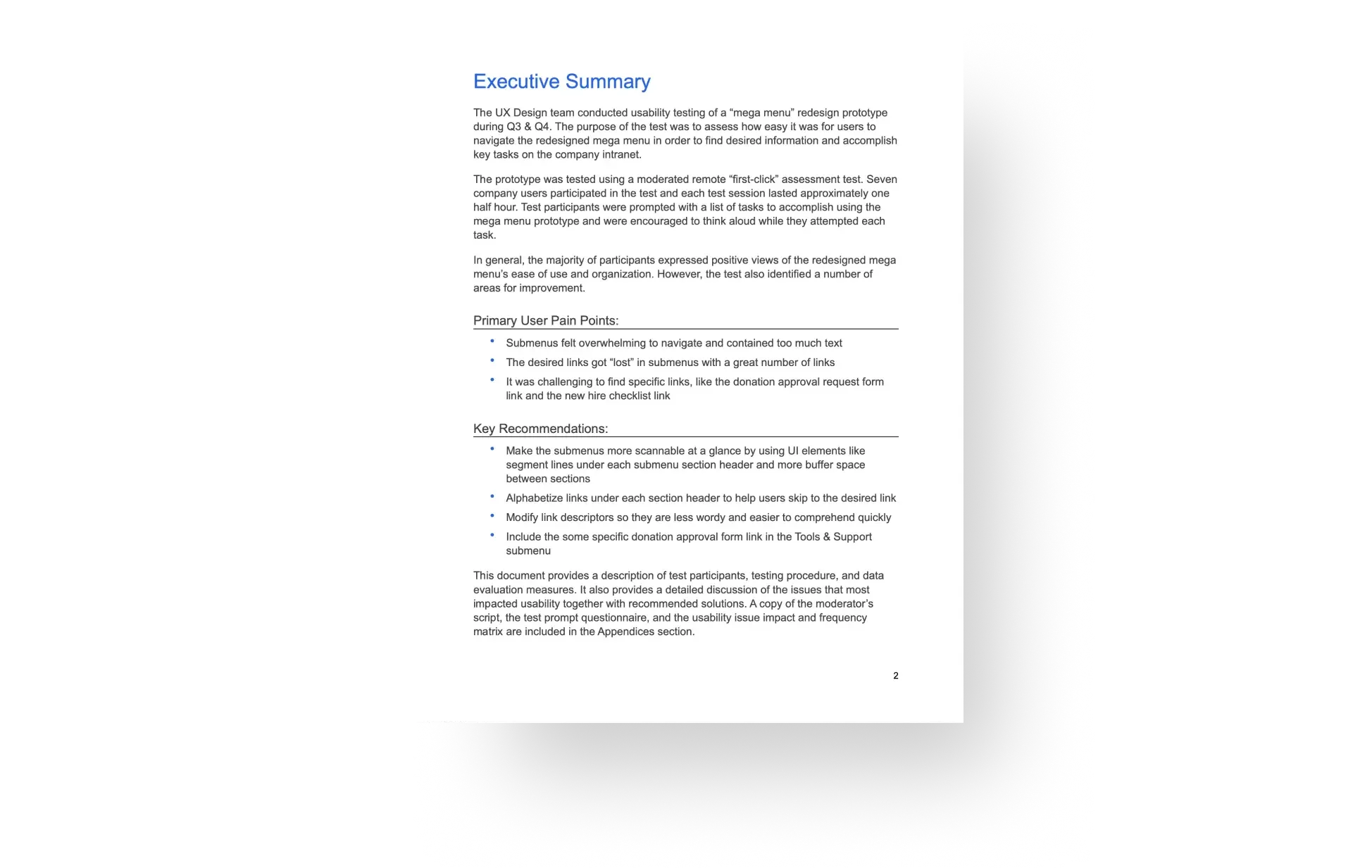
![Report executive summary page screenshot]()
A concise summary for stakeholders
A one-page executive summary gave busy stakeholders a quick overview of the project, including the testing goals, methodology, key findings, and recommendations.
-
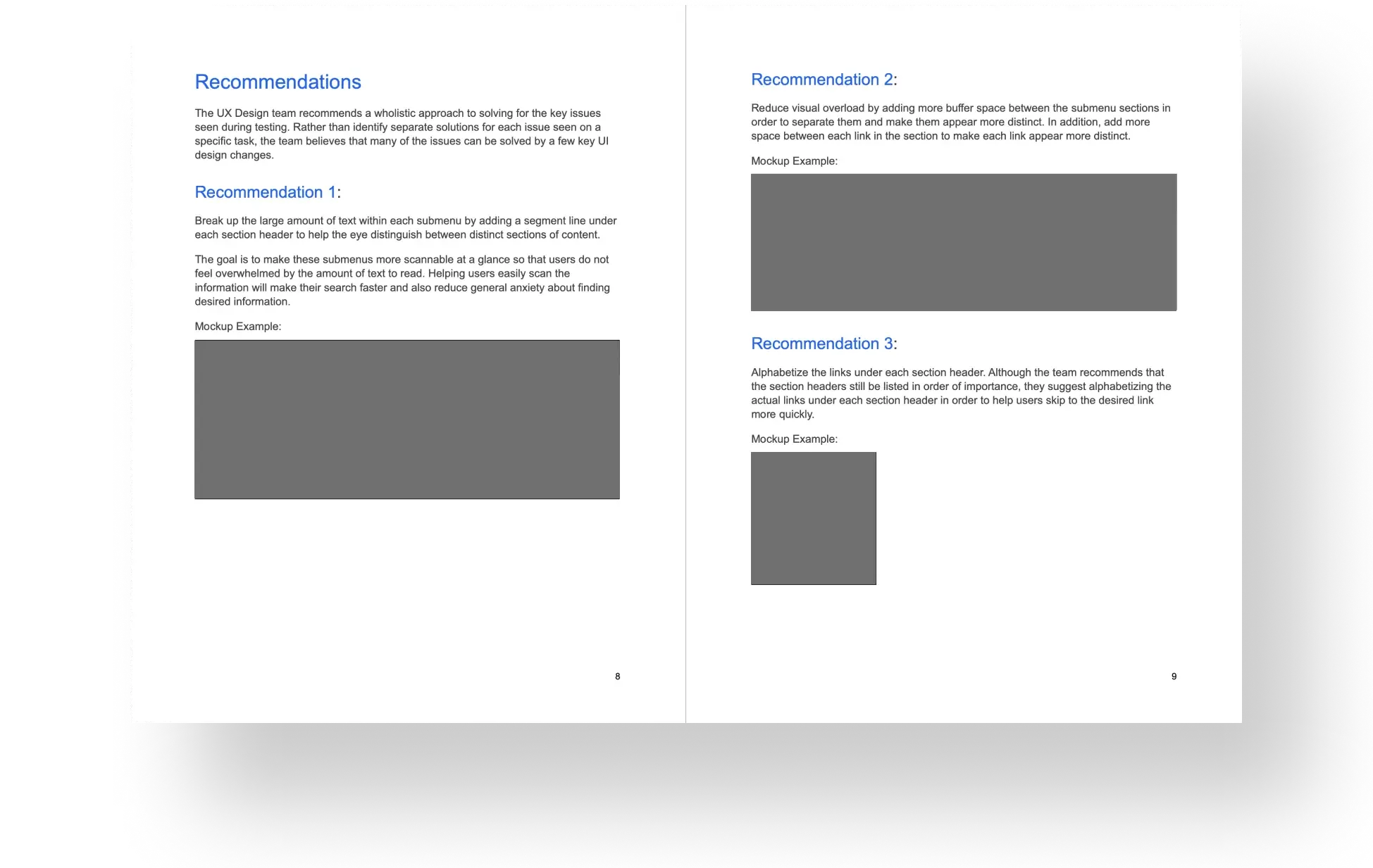
![Report recommendations page screenshot]()
Recommendations backed by evidence
The report linked findings to design recommendations, using examples to show how the proposed changes could make the menu easier to scan and understand.
-
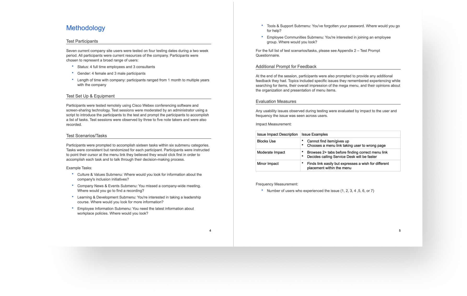
![Report testing methodology page screenshot]()
Methodology for a closer look at the details
For stakeholders who wanted more detail, this section of the report documented the testing approach, participant characteristics, task scenarios and evaluation measures.
*Report visuals have been adapted to remove confidential company information.
Testing gave the design team a clearer direction and the recommendations carried through to production.
The design team incorporated the recommendations into the updated menu, which went live in production. We didn't have the resources to retest the changes after launch, so we weren't able to measure their impact.
One thing I took away from this project was how useful it is to review findings as a team. Different people notice different things, and discussing them together helped us see patterns we might have missed on our own.
Need a UX designer?